
My design explores how the University of Hull’s history can connect with visuals and communication. I want the identity to bring together vintage and modern elements without treating the university’s history as separate from its future. My board shows a starting point for looking at ideas: photography, concept, and the relationship between historical and contemporary imagery.
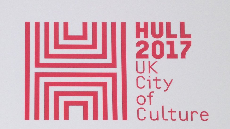
Hull’s visual identity is a key influence, particularly the geometric H used in the Hull 2017 UK City of Culture campaign. The Bauhaus 100 identity inspired me to consider how the number 100 can become a central graphic element rather than simply appearing as text. I am interested in how a letterform can become more than a logo and develop into a flexible graphic element. I intend to explore an abstract H inspired by framing, but with my own construction, proportions, and visual treatment.

The number 100 will be central to the centenary identity. I plan to experiment with combining the H into the numerals, using it as a cut-out or incorporating it into a repeating pattern. These experiments will help me assess whether the H and the number can work together as a recognisable mark. I will also test different scales and arrangements to ensure the centenary remains clear across applications.
Historical imagery will directly connect to Hull’s past.
I could combine photographs of the university’s early buildings, historic students, maritime heritage, and other relevant archival material with contemporary typography and graphic shapes. Contrasting these elements will help communicate the university’s development over time without making the campaign feel entirely vintage.
Colour and texture will also contribute to the visual language. I will test combinations that retain historical character while giving the work a contemporary appearance. Rather than applying a vintage effect to every image, I will explore how original archival material can contrast with cleaner, more modern design elements.
Through these experiments, I want to explore different compositions, proportions, and ways to combine imagery and typography, which still need development.
began experimenting with the number 100, the letter H and geometric shapes in Adobe Illustrator. I explored different arrangements, outlines and colour combinations to see how these elements could represent the university’s centenary.
My experiments use lime green, pink and cobalt blue. I wanted a bright, modern palette that would help the campaign stand out while keeping the shapes and typography recognisable; the colours come from the University of Hull’s background palette.
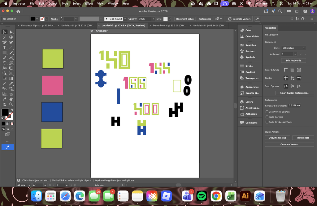
This first set of experiments let me explore several directions rather than committing to one design immediately. I tested different ways of combining the numbers and considered how the H could become a supporting graphic motif. These explorations are still in development, but they are helping me identify which shapes and arrangements have the most potential.
My Concept
My developing concept explores how the University of Hull’s centenary could be represented through a visual identity that connects its history with its future. The number 100 is the starting point, while the H is being explored as a possible motif to link the different campaign materials.
I want the identity to feel both historical and contemporary. The university’s history could be communicated through archival photographs, stories and references to Hull’s cultural identity. At the same time, geometric shapes, bold colour and modern typography could give the campaign a more current visual style.
The identity could be applied to a centenary poster, social media graphics and a microsite. The microsite could introduce the university’s history, highlight important people and achievements, and present stories connected to the centenary.
At this stage, these applications are proposed directions. The visual identity still needs further refinement before developing the final campaign materials.
Alongside the number and letter experiments, I explored how a geometric motif could be repeated to create a larger pattern. I wanted to see whether the shapes and colours could work as a consistent visual element beyond a single logo or symbol.
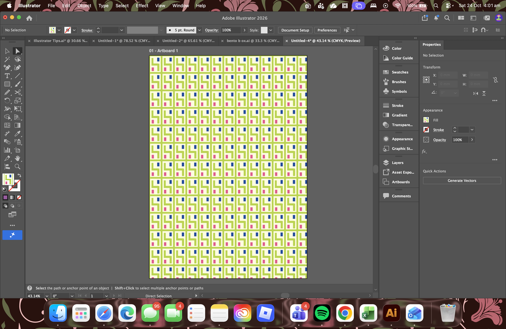
The pattern shows how a small number of shapes can form a continuous design. It could potentially be used as a background or supporting graphic across campaign materials. However, I will need to consider its scale and visual density to ensure it doesn’t compete with important information.
These experiments have helped me begin developing a visual direction for the centenary campaign. Next, I will refine the strongest number and H arrangements, explore how they work together, and test the developing identity in practical applications. This will help me assess whether the visual elements form a consistent system that communicates the connection between the university’s history and its future.
Design summary
The work shown in this section represents an exploratory stage of the design process. The experiments aim to explore possibilities, test visual decisions, and inform the next stage of development, rather than present a completed identity.
References
- Dawood, S. (2016) ‘Jaywing creates branding for cultural initiative Hull 2017’, Design Week, 23 September. Available at: https://www.designweek.co.uk/issues/19-25-september-2016/jaywing-creates-branding-cultural-initiative-hull-2017/ (Accessed: 21 October 2026).
- University of Hull (n.d.) Our history. Available at: https://www.hull.ac.uk/about/our-history (Accessed: 24 October 2026).
- University of Hull (n.d.) Our mission, vision and values. Available at: https://www.hull.ac.uk/about/our-mission-vision-and-values (Accessed: 24 October 2026).
- Wolff Olins (n.d.) The Met. Available at: https://www.wolffolins.com/work/the-met (Accessed: 24 October 2026).
