This post shows the early design elements you created to establish the visual identity of your Urban Art app. These are NOT final; they are the building blocks that later become your style guide.
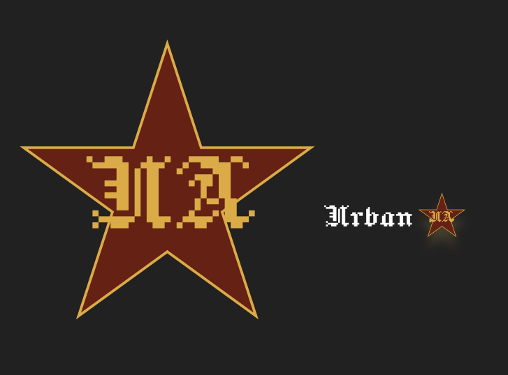
The primary logo explores a bold, graphic identity inspired by contemporary urban art. The star shape creates a strong visual anchor and reflects the expressive tone of the gallery brand. Secondary Logo: A simplified version of the star symbol used for buttons, icons, and small UI elements.
Secondary Logo / Primary Logo
Hierarchical Typefaces
Headings: Playfair Display Body Text: Inter Decorative: Lora
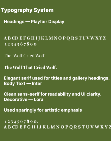
These typefaces were selected to balance a refined gallery aesthetic with clear mobile readability.
Colour Palette
3F4F1E — Deep Olive Green 6B7A3A — Moss Green E6D75E — Muted Gold E6E87A — Soft Yellow F9F9F1 — Off‑White – 4B365A — Deep Purple
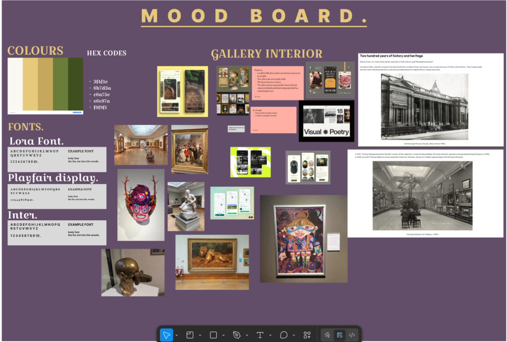
This palette was developed from the mood board and reflects earthy, gallery-inspired tones.
These elements support the brand tone and add visual character without overwhelming the UI.
Buttons & Reusable UI Components
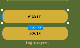
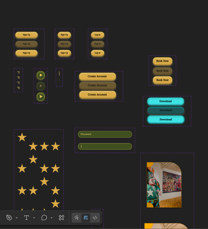
These components were created to test spacing, alignment, and usability during early development.
The design elements presented in this post represent the early stages of developing the Urban Art mobile app’s visual identity. At this point in the process, the focus was on exploring ideas rather than finalising a polished brand system. The primary logo and secondary icon were created to establish a recognisable visual anchor that could be used consistently across screens. The star motif was chosen because it reflects the expressive, bold nature of urban art while remaining simple enough to function at different scales.
The early colour palette was developed from the initial mood board, which featured earthy greens, warm golds, and muted tones inspired by gallery interiors and natural pigments. These colours were selected to create a calm, curated atmosphere suitable for displaying artwork. Although the palette may evolve later, these early choices helped guide the tone and mood of the interface during the initial design stages.
Typography choices were also tested at this stage. Playfair Display was explored for headings to give the app a refined, gallery‑style feel, while Inter was chosen for body text due to its clarity and readability on mobile screens. These early decisions helped establish hierarchy and informed how text would be structured in later prototypes.
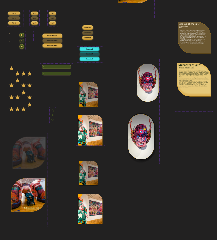
UI components such as buttons, input fields, and artwork cards were created to test spacing, alignment, and usability. These elements were not final but served as functional building blocks that allowed early wireframes and low‑fidelity prototypes to be developed. Decorative elements, including star icons and textured backgrounds, were also explored to see how they could support the brand identity without distracting from the artwork.
Overall, these early design elements formed the foundation for later refinement and helped shape the direction of the Urban Art app’s visual identity.