This post reflects on the design decisions made throughout the development of the urban art mobile app. It includes the assumptions that shaped the design process, the criteria used to define success, and the visual research that informed the final direction.
Assumptions Made During the Design Process
During development, several assumptions guided the design:
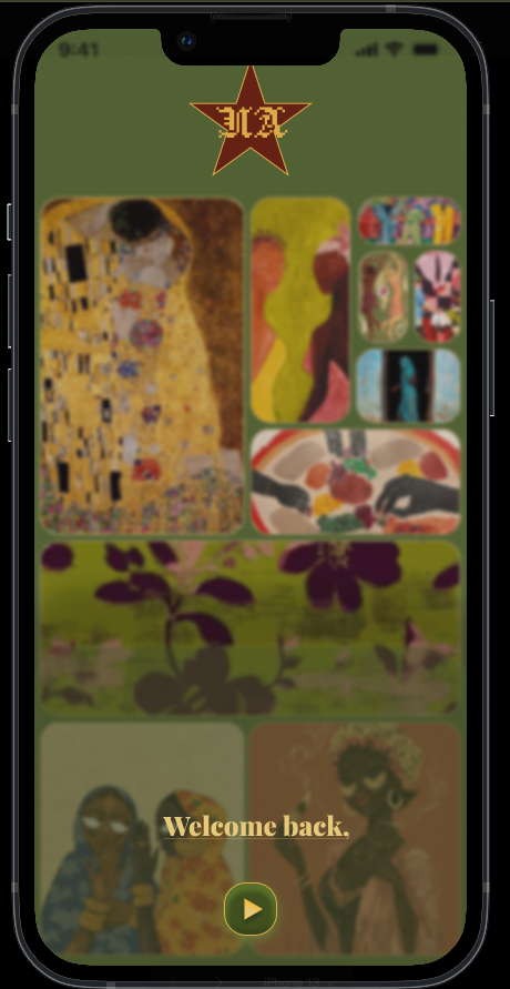
Users would want a simple, calm interface that does not distract from the artwork.
The app would be used before and during a gallery visit, meaning navigation needed to be fast and intuitive.
Users would expect clear categories, easy access to artwork details, and minimal text.
The gallery brand should feel modern, earthy, and artistic, not corporate or overly digital.
Most users would be familiar with standard mobile navigation patterns, so the design should follow common conventions.
What Success Looks Like
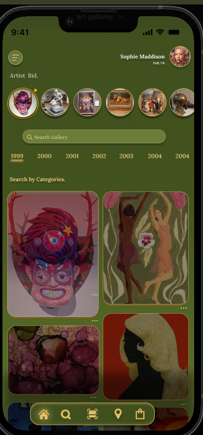
Users can navigate the app without confusion.
Artwork is presented clearly and attractively.
The visual identity feels consistent and recognisable.
The app supports both exploration (browsing) and purposeful actions (finding information).
The design reflects the Urban Art brand tone: earthy and expressive.
Visual Research & Documentation
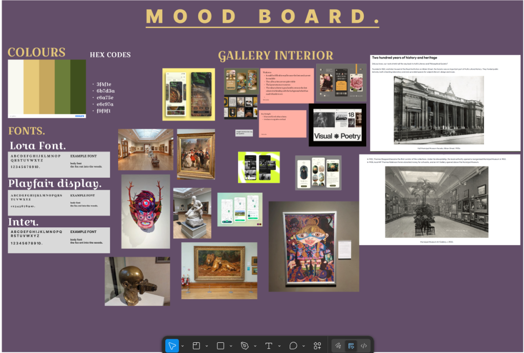
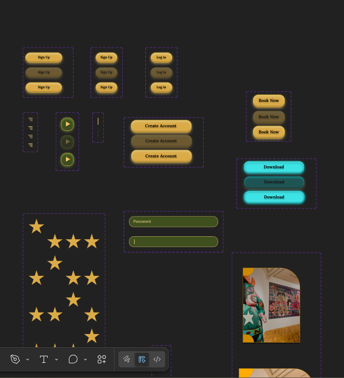
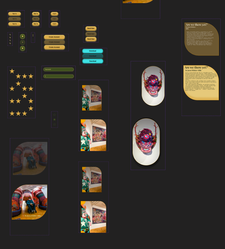
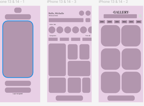
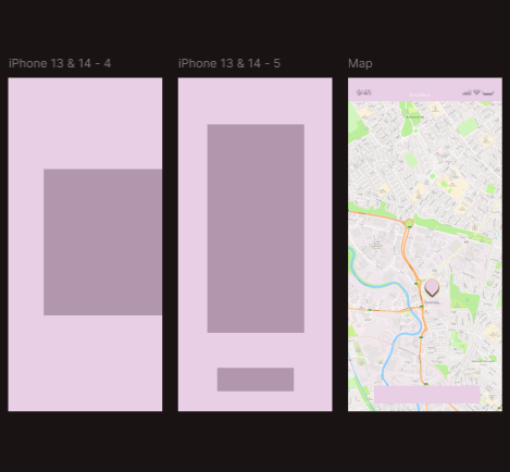
Visual research played a major role in shaping the design. The mood board established the earthy green and gold palette, while gallery interiors inspired the clean, spacious layouts. Early wireframes helped refine structure, and UI component tests ensured consistency across screens.
Evaluation
The design reflection stage allowed me to evaluate the decisions made throughout the development of the Urban Art mobile app and understand how each choice contributed to the outcome. One of the key assumptions I made early in the process was that users would want a calm, visually balanced interface that prioritised artwork over decorative elements. This assumption guided the use of an earthy colour palette and spacious layouts, helping create a gallery.
like atmosphere within the app. I also assumed that users would be familiar with common mobile navigation patterns, which influenced the decision to use a simple bottom navigation bar and clear page hierarchy.
Success for this project was defined by usability, clarity, and consistency. The app needed to support both browsing and purposeful navigation, allowing users to explore artwork easily while also accessing practical information. The high‑fidelity screens demonstrate how these goals were achieved through consistent typography, clear spacing, and intuitive interaction patterns. The use of Playfair Display for headings and Inter for body text helped establish a strong visual hierarchy, while the colour palette reinforced the brand identity without overwhelming the content.
Visual research played a significant role in shaping the final design. The mood board provided direction for the colour palette and overall tone, while early sketches and wireframes helped refine the structure before moving into detailed visuals. Reviewing gallery interfaces and contemporary art apps also helped identify best practices for presenting artwork on mobile screens. This research ensured that the final design felt both modern and appropriate for the Urban Art brand.
Overall, the reflection process highlighted the importance of iterative development, user‑centred thinking, and consistent visual language. These insights will continue to inform future design work and contribute to a more refined final portfolio.