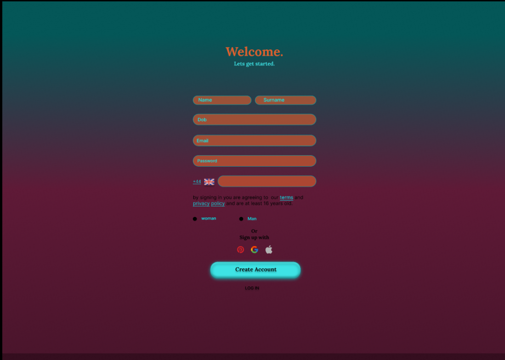
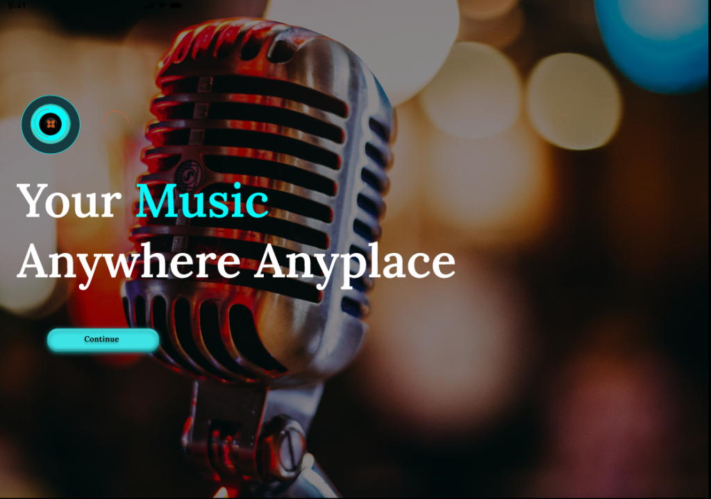
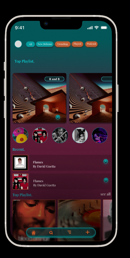
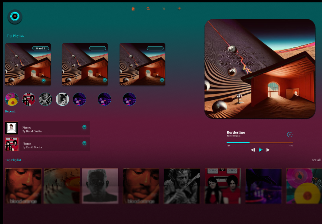
Following the development of the mobile prototype, I adapted the Amplify Music Fest app for desktop using Figma. I aimed to translate the mobile experience into a layout that takes advantage of larger screens, multicolumn structures, and mouse‑based interaction. The desktop version maintains the same visual identity as the mobile app but restructures content to improve readability, navigation, and information density. Key screens include the homepage, login, artist library, artist profiles, live updates, favourites, and ticket access.
Layout and Navigation Adjustments
One of the most significant changes was shifting from a bottom navigation bar to a top horizontal navigation menu, which aligns with established web conventions. This allows users to quickly scan available sections and reduces the need for scrolling. The desktop layout uses two and three-column grids, enabling more content to be visible at once. For example, the artist library displays multiple rows of cards, while the homepage pairs a large hero image with introductory text and call-to-action buttons. Forms such as login and sign‑up were widened and spaced more generously to support keyboard input and improve accessibility.
Visual Style & Colour Palette
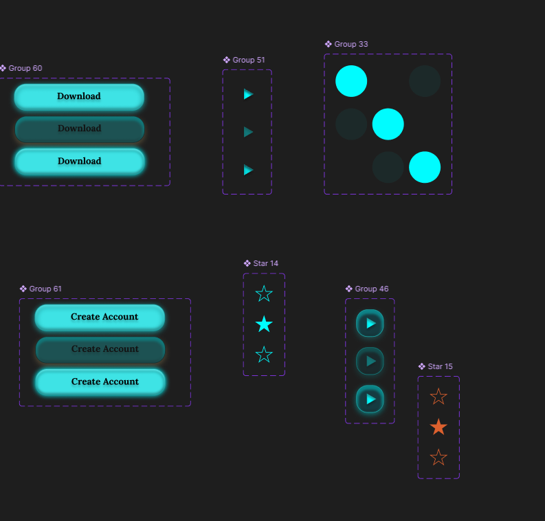
The desktop version retains the same colour palette established in the mobile prototype to ensure brand consistency:
DC602E — Deep Red
00FCFF — Neon Aqua
1BA0A2 — Teal
153B41 — Dark Blue‑Green
000000 — Black (Primary Background)
3EE3E5 — Bright Cyan
9D4623 — Burnt Orange
FFFFFF — White (Contrast Text)
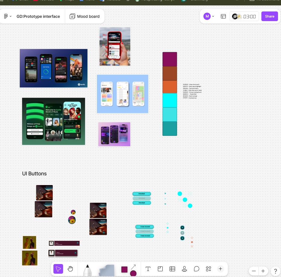
These colours maintain strong contrast and support visibility across different screen types.
Evaluation
Adapting the mobile design for desktop required rethinking layout, spacing, and interaction patterns while preserving the core identity of the app. The increased screen real estate allowed for richer content presentation, but it also introduced the challenge of preventing visual overload. Using a structured grid system helped maintain clarity and balance. Moving navigation to the top of the screen aligns with common web UI patterns and supports faster scanning (Nielsen Norman Group, 2020). Retaining the mobile colour palette ensures continuity across platforms, reinforcing the festival’s branding. Overall, the desktop adaptation successfully extends the mobile experience into a more spacious, flexible format suitable for pre‑event browsing and planning. (Material Design, 2024)
Figma Link https://www.figma.com/design/YGW5GAutxsuVnk2j7zMEK1/Music-Fest-App?t=bkZKbVInrBCDKx1v-0
REFERENCES
Apple. (2023) Human Interface Guidelines. Available at: https://developer.apple.com/design/human-interface-guidelines/ (developer.apple.com in Bing) (Accessed: 19 May 2026).
Coachella. (2023) Coachella Festival App. Available at: https://www.coachella.com (Accessed: 19 May 2026).
Glastonbury Festival. (2024) Glastonbury Official App. Available at: https://www.glastonburyfestivals.co.uk (glastonburyfestivals.co.uk in Bing) (Accessed: 19 May 2026).
Google. (2024) Material Design Guidelines. Available at: https://m3.material.io (Accessed: 19 May 2026).
Nielsen, J. (1994) 10 Usability Heuristics for User Interface Design. Nielsen Norman Group. Available at: https://www.nngroup.com/articles/ten-usability-heuristics/ (nngroup.com in Bing) (Accessed: 19 May 2026).
Nielsen Norman Group. (2020) Top Navigation vs. Side Navigation. Available at: