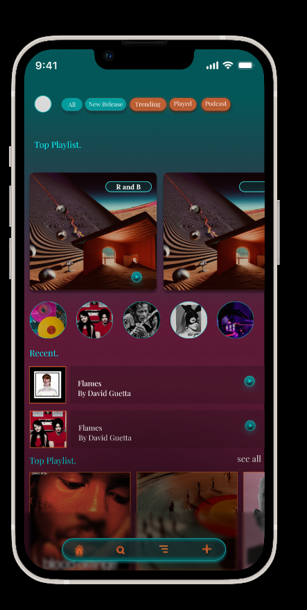
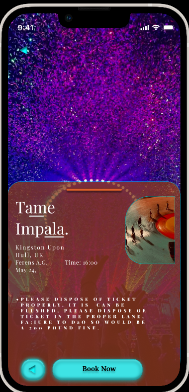
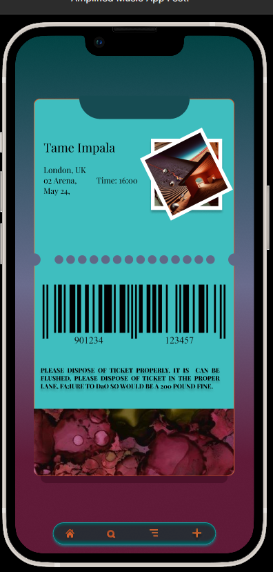
Building on the low‑fidelity wireframes from Post 2, I developed a full high‑fidelity mobile prototype for the Amplify Music Fest app using Figma. This stage focused on transforming the structural layouts into a polished interface that reflects the festival’s energetic identity. The design incorporates refined typography, consistent spacing, and a component‑based system that ensures visual coherence across all screens. Key pages include the landing screen, login, home dashboard, library, artist profiles, live updates, favourites, and the digital ticket.
Visual Style & Colour Palette
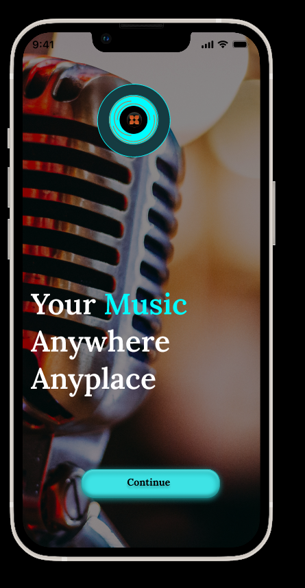
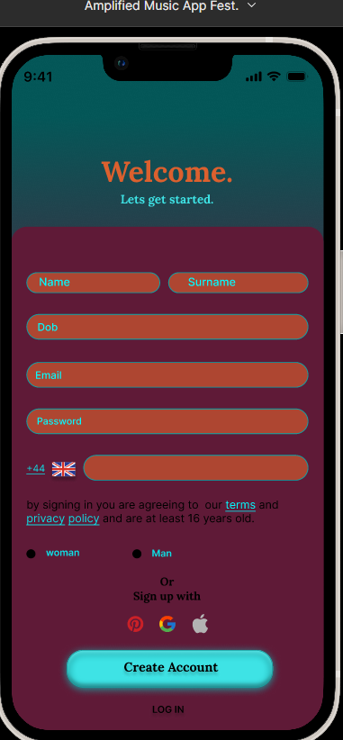
The high‑fidelity prototype uses a bold, atmospheric visual style inspired by electronic festival environments. The colour palette was developed from stage‑lighting references and refined into a cohesive UI system:
DC602E — Deep Red 00FCFF — Neon Aqua 1BA0A2 — Teal 153B41 — Dark Blue‑Green 000000 — Black (Primary Background) 3EE3E5 — Bright Cyan 9D4623 — Burnt Orange FFFFFF — White (Contrast Text)
These colours support readability in low‑light conditions and create a distinctive brand identity. Components such as buttons, cards, and navigation icons were built using this palette to maintain consistency.
Interaction & Prototyping
Using Figma’s prototyping tools, I linked all major screens to simulate realistic user journeys. Key interactions include navigating between sections via the bottom bar, opening artist pages from the library, adding favourites, and accessing the digital ticket. Transitions were kept minimal to prioritise clarity and speed.
Evaluation
Developing the high‑fidelity prototype allowed me to refine the app’s visual identity and ensure that the interface supports real festival use. The dark background combined with neon accents enhances visibility at night, while the component‑based system ensures consistency and reduces cognitive load. Creating reusable elements also mirrors professional UI workflows, improving efficiency and supporting scalability. The prototype revealed areas for improvement, such as increasing tap target sizes and adjusting spacing to avoid accidental presses in crowded environments. Overall, the high‑fidelity stage successfully translates the research and wireframes into a cohesive, user‑centred design that feels polished, functional, and aligned with the festival’s atmosphere. (Material Design, 2024; Apple HIG, 2023)
References.
Apple. (2023) Human Interface Guidelines. Available at: https://developer.apple.com/design/human-interface-guidelines/ (developer.apple.com in Bing) (Accessed: 19 May 2026).
Coachella. (2023) Coachella Festival App. Available at: https://www.coachella.com (Accessed: 19 May 2026).
Glastonbury Festival. (2024) Glastonbury Official App. Available at: https://www.glastonburyfestivals.co.uk (glastonburyfestivals.co.uk in Bing) (Accessed: 19 May 2026).
Google. (2024) Material Design Guidelines. Available at: https://m3.material.io (Accessed: 19 May 2026).
Nielsen, J. (1994) 10 Usability Heuristics for User Interface Design. Nielsen Norman Group. Available at: https://www.nngroup.com/articles/ten-usability-heuristics/ (nngroup.com in Bing) (Accessed: 19 May 2026).
Nielsen Norman Group. (2020) Top Navigation vs. Side Navigation. Available at: https://www.nngroup.com (Accessed: 19 May 2026).