UX Design Statement
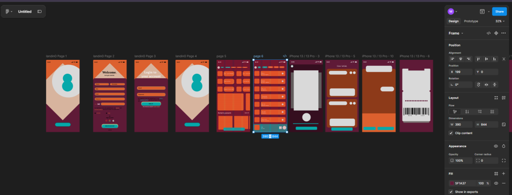
The Amplify Music Fest app is designed to support festival‑goers before, during, and after the event by providing fast access to essential information such as artists, schedules, live updates, and ticket details. The UX approach prioritises clarity, speed, and reduced cognitive load, ensuring users can navigate confidently in busy, low‑light festival environments. My goal at this stage was to establish a clear structure that reflects real user needs identified in Post 1, while keeping layouts simple and functional for early testing.
Key Pages and Features
Based on my research, I identified the core screens required for the app:
- Landing / Login
- Home Dashboard
- Library (Artists & Music)
- Artist Detail Page
- Live Updates
- Favourites
- Digital Ticket
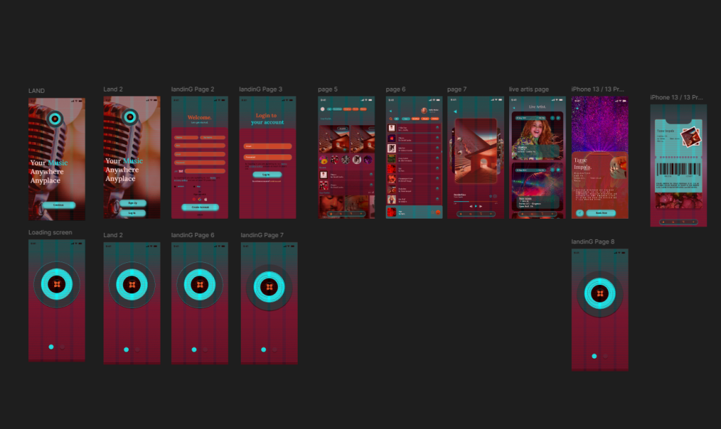
These pages represent the minimum feature set needed to support festival behaviour such as discovering performers, checking who is live, and accessing tickets quickly.
Navigation Approach
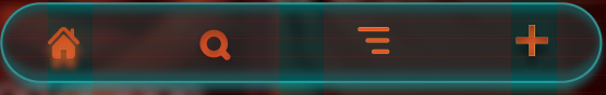
I explored several navigation patterns before selecting a navigation bar, as this is familiar to users and supports one‑handed use. The five main sections, Home, Library, Live, Favourites, and Tickets, remain visible at all times, reducing friction and improving wayfinding. This decision was informed by common patterns in apps like Festival, which emphasise persistent navigation for fast switching between tasks (Nielsen, 1994).
User Journeys
I mapped four essential journeys:
Accessing the digital ticket at the festival gate
Discovering a new artist and adding them to favourites
Checking who is performing live
Browsing the library to explore music
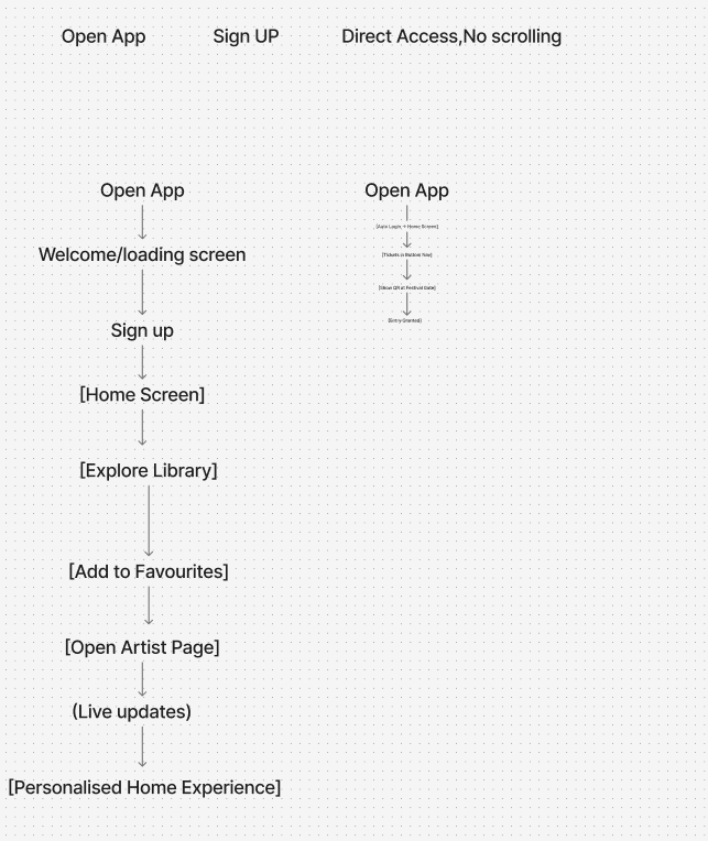
These journeys helped define the order of information and the placement of interactive elements.
Evaluation
Developing the user flow and wireframes allowed me to translate my research into a functional structure. Working in low‑fidelity meant I could focus on hierarchy, spacing, and usability without being distracted by colour or visual styling. The wireframes revealed opportunities to simplify layouts, such as reducing unnecessary text and prioritising large tap targets for festival conditions. Mapping user journeys ensured that each screen supports real behaviours, particularly quick access to tickets and live information. Overall, this stage created a strong foundation for the high‑fidelity prototype.
Figma app structure: https://www.figma.com/design/KW8K5lWRVG0si3l015T3Kh/Amplified-Music-App-Fest.?node-id=0-1&t=bkZKbVInrBCDKx1v-1
REFERENCES
Apple. (2023) Human Interface Guidelines. Available at: https://developer.apple.com/design/human-interface-guidelines/ (developer.apple.com in Bing) (Accessed: 19 May 2026).
Coachella. (2023) Coachella Festival App. Available at: https://www.coachella.com (Accessed: 19 May 2026).
Glastonbury Festival. (2024) Glastonbury Official App. Available at: https://www.glastonburyfestivals.co.uk (glastonburyfestivals.co.uk in Bing) (Accessed: 19 May 2026).
Google. (2024) Material Design Guidelines. Available at: https://m3.material.io (Accessed: 19 May 2026).
Nielsen, J. (1994) 10 Usability Heuristics for User Interface Design. Nielsen Norman Group. Available at: https://www.nngroup.com/articles/ten-usability-heuristics/ (nngroup.com in Bing) (Accessed: 19 May 2026).
Nielsen Norman Group. (2020) Top Navigation vs. Side Navigation. Available at: