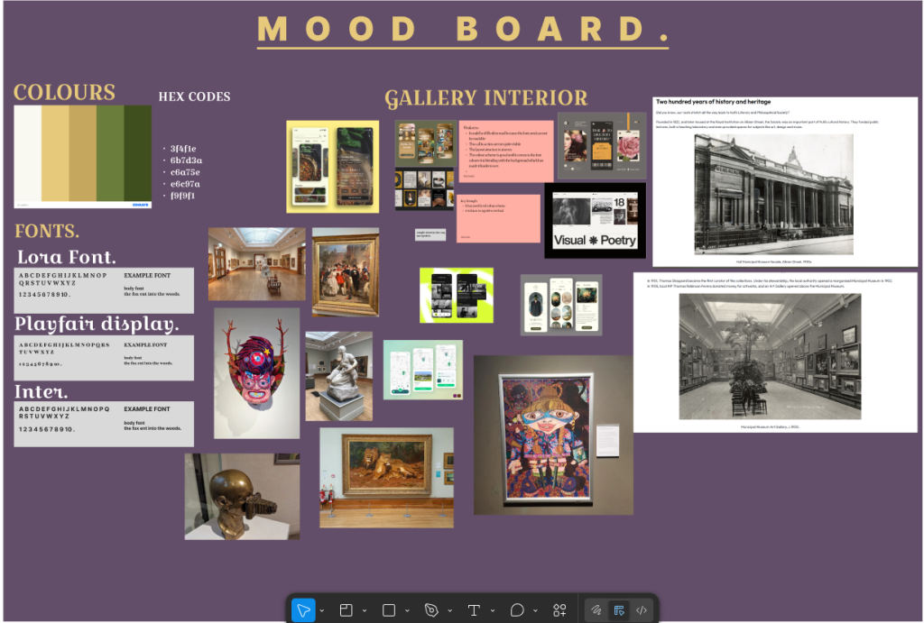
Initial Ideas and Concept Exploration
For this project, I began by exploring how a mobile companion app could enhance the experience of Amplify Music Fest. I also took ideas from one of the assignments given for our gallery, so I added that into the blog post. I created an outdoor festival in the north of England. My early ideas focused on supporting users before, during, and after the event through features such as artist discovery, live updates, ticket access, and personalised favourites. I explored different festival themes before settling on an electronic‑influenced visual direction, as it aligned well with bold colours, energetic shapes, and dynamic UI elements.
Research into Existing Festival Apps
To understand common UX patterns, I analysed existing festival and music apps, including Glastonbury, Coachella, and Spotify. These apps consistently use card‑based layouts, simple navigation, and strong visual hierarchy. I also noted weaknesses such as cluttered screens and slow access to essential information. This research helped me define a cleaner, more focused approach for my own design. (Glastonbury Festival, 2024; Coachella, 2023)
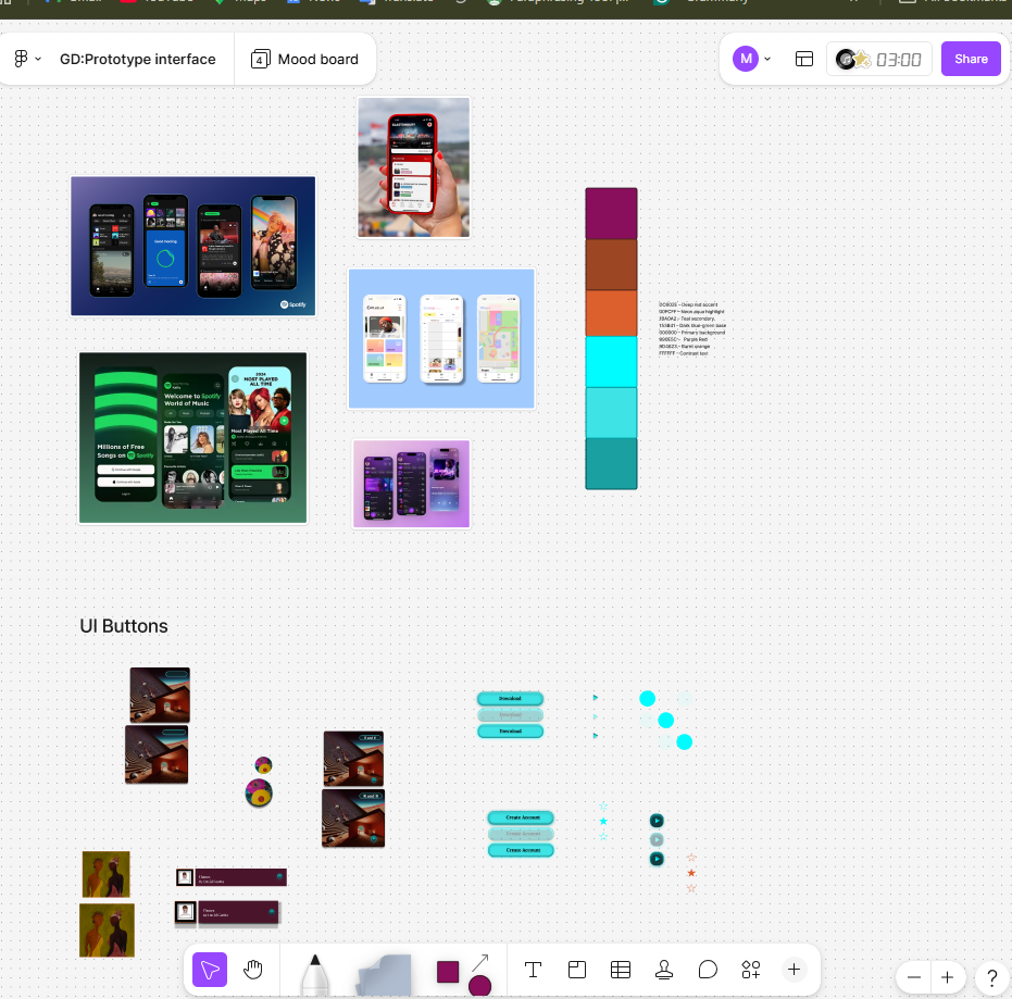
Visual Style & Colour Palette
My mood boards explored neon lighting, dark environments, and high‑contrast gradients inspired by festival stages. From this, I developed a colour palette that reflects the atmosphere of live music.
DC602E — Deep Red 00FCFF — Neon Aqua 1BA0A2 — Teal 153B41 — Dark Blue‑Green 000000 — Black (Primary Background) 3EE3E5 — Bright Cyan 9D4623 — Burnt Orange FFFFFF — White (Contrast Text)
I sampled these colours from stage lighting references and refined them into a cohesive palette.
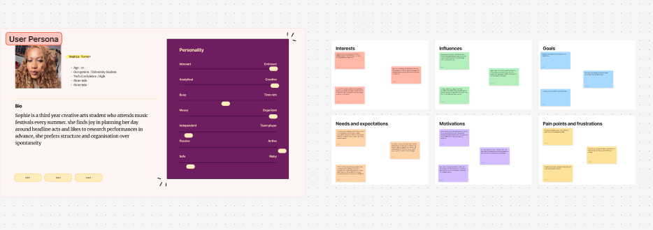
User Persona
Evaluation
The research phase shaped the direction of the Amplify Music Fest app by grounding my decisions in real user needs and establishing UX patterns. Analysing existing festival apps highlighted the importance of clarity, fast access to information, and intuitive navigation. This directly influenced my decision to use a simple structure with clear sections for Home, Library, Live, Favourites, and Tickets.
Developing mood boards helped define the visual identity, ensuring the app feels atmospheric and suitable for low‑light environments. The colour palette supports both usability and branding, creating a recognisable and immersive experience. Personas allowed me to consider different user motivations, ensuring the app supports both spontaneous and organised festival‑goers.
Overall, this research provides a strong foundation for the next design stages.
REFERENCES
Apple. (2023) Human Interface Guidelines. Available at: https://developer.apple.com/design/human-interface-guidelines/ (developer.apple.com in Bing) (Accessed: 19 May 2026).
Coachella. (2023) Coachella Festival App. Available at: https://www.coachella.com (Accessed: 19 May 2026).
Glastonbury Festival. (2024) Glastonbury Official App. Available at (glastonburyfestivals.co.uk in Bing) (Accessed: 19 May 2026).
Google. (2024) Material Design Guidelines. Available at: https://m3.material.io (Accessed: 19 May 2026).
Nielsen, J. (1994) 10 Usability Heuristics for User Interface Design. Nielsen Norman Group. Available at: https://www.nngroup.com/articles/ten-usability-heuristics/ (nngroup.com in Bing) (Accessed: 19 May 2026).
Nielsen Norman Group. (2020) Top Navigation vs. Side Navigation. Available at: