INTRODUCTION
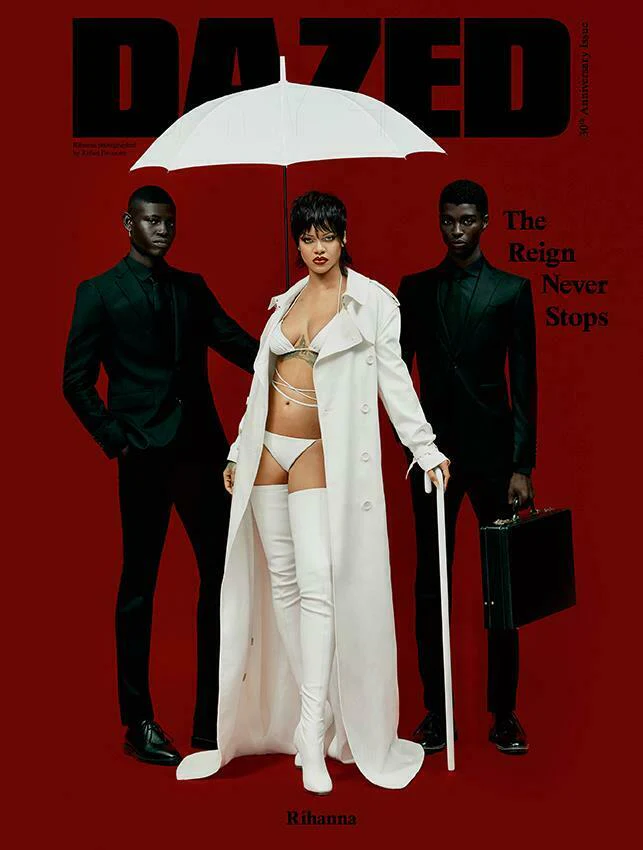
Dazed Magazine (2021) Autumn Issue featuring Rihanna, photographed by Rafael Pavarotti. Source: Dazed Digital / YourCelebrityMagazines.
Strong Example of Effective Composition in Editorial Design
The composition of the Dazed Autumn 2021 “The Reign Never Stops” cover combines artistic accuracy with strong imagery. The image, which has Rihanna in the centre in white against a saturated red background, contrasts sharply with two figures on either side wearing black suits. This triadic layout establishes stability by forming a pyramidal composition through balanced placement (Wong, 1993). To ensure that the viewer’s focus remains on the main subject while acknowledging the compositional unity of the ensemble, the high tonal contrast between white and black against red creates instant figure–ground clarity.
The use of colour contrast and spatial hierarchy conveys authority and dominance. The flanking attendants act as compositional anchors, stabilising the frame and guiding the eye inward towards Rihanna. Subtle diagonals, such as the angled briefcase and the asymmetric stance of the figures, introduce rhythm and movement—an application of the principle of directional flow (Lupton, 2010). Despite its simplicity, the spatial tension between stillness and motion gives the composition depth and energy.
Typography contributes structural balance rather than distraction. The DAZED masthead, rendered in bold black sans-serif, forms a visual canopy above the figures. The opening line “THE REIGN NEVER STOPS” and the subline “Rihanna” below it confirm the piece’s stability by aligning across with the shoulders of the figures (Samara, 2014). Visual order is reinforced by the constant alignment of type and imagery, which shows a sophisticated grasp of compositional dialogue.
in conclusion, the cover is a perfect example of how Dazed transforms conceptual strength into a graphically organised layout. It expresses a sophisticated hierarchy where each component—subject, space, and type—contributes to a cohesive and powerful editorial composition through proportion, symmetry, and rhythmic contrast.
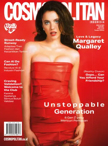
Cosmopolitan Indonesia (2009) Redesign
Analysis of Poor 2D Layout and Redesign Process
The layout and 2D composition of the original Cosmopolitan Indonesia August 2009 cover were seriously flawed. Poor spatial hierarchy, uneven alignment, and an overabundance of textual elements plagued the design. The main figure was overpowered by numerous fonts and vivid colour schemes, which caused visual clutter and distracted attention. Effective composition, according to Wong (1993), depends on spatial balance and clarity through proportion; however, the cover’s haphazard element placement disregarded these guidelines. While excessive saturation in the background and text reduced readability and aesthetic harmony, the masthead and subheadings fought for attention.
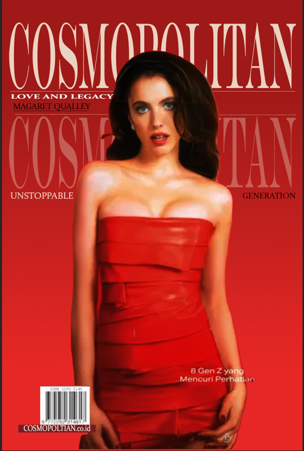
In order to fix these problems, the cover was redone in Adobe Photoshop utilising simple shapes and alignment rules to enforce balance and order. The new guide layout was used to create a modular three-column grid that guaranteed proportional symmetry and even spacing. Secondary text was uniformly positioned along the top and bottom to support rhythmic flow, and the central portrait was recentred to establish vertical stability. Red, cream, and white were used as a simplified colour scheme to improve coherence and contrast. In order to improve the figure–ground relationship as outlined by Samara (2014), the redesign also made use of negative space surrounding the model to restore visual breathing room.
The redesign turns a disorganised layout into a consistent editorial composition by carefully utilising alignment, proportion, and restraint. By leading the viewer’s eye from the masthead to the focal figure and then to the subtext, the updated design exhibits compositional control. It demonstrates hierarchy and balance in 2D design while effectively conveying Cosmopolitan’s aspirational tone.
Reference List
Dazed Magazine (2021) Rihanna – Autumn 2021 (Red Veil Cover). [Online image]. Available at: https://www.dazeddigital.com/music/gallery/30184/0/rihanna-autumn-2021 (Accessed: 10 November 2025).
Lupton, E. (2010) Thinking with Type: A Critical Guide for Designers, Writers, Editors, and Students. 2nd edn. New York: Princeton Architectural Press.
Samara, T. (2014) Making and Breaking the Grid: A Graphic Design Layout Workshop. 2nd edn. Beverly, MA: Rockport Publishers.
Wong, W. (1993) Principles of Form and Design. New York: Van Nostrand Reinhold.
Cosmopolitan Indonesia (2009) August Issue. [Online image]. Available at: https://www.pinterest.com/ccrcj503/design-no-nos/ (Accessed: 10 November 2025).
Samara, T. (2014) Making and Breaking the Grid: A Graphic Design Layout Workshop. 2nd edn. Beverly, MA: Rockport Publishers.
Wong, W. (1993) Principles of Form and Design. New York: Van Nostrand Reinhold.