Romance novels are typically associated with story lines that are passionate, love filled, and even heartbreaking. but conceptual design is another important component that is vital to drawing in readers . this includes everything from the font to the cover art, which may all have big impact on how a reader feels about a book before they ever flip a page

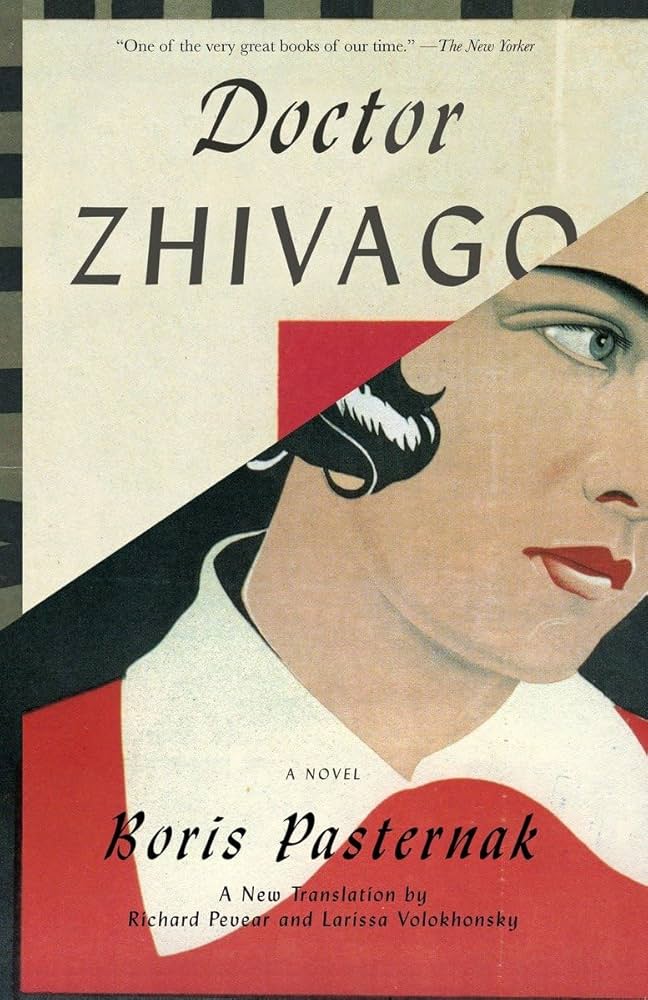
Figure 1. https://m.media-amazon.com/images/I/71BUj7cATPL.AC_UF894,1000_QL80.jpg
Title: Doctor Zhivago
Author: Boris Pasternak
Publisher: Vintage books, a division of random house
Regarding the book cover, Boris Pasternak’s classic worldwide edition of Doctor Zhi is a striking illustration of conceptual design. This edition is a fantastic case study for anybody interested in the nexus between design and literature because of its smart and evocative cover art, which perfectly captures the essence of the book.
Another important component is the colour scheme. The sombre and contemplative tone of the book is reflected in the use of subdued, icy hues like blues and whites. In light of the Russian Revolution, these hues emphasise the concepts of perseverance and hardship. Warmer hues, such as crimson, can occasionally be used to represent passionate, loving, and selfless moments, giving the visual story more nuance.
This edition’s use of images is among its most striking elements. Snow-covered landscapes, which are essential to the novel’s Russian setting, are frequently shown on the cover. These pictures instantly conjure up the bleak and picturesque Russian winters that are central to the narrative. In addition to providing the geographical background, the snow-covered sceneries represent the characters’ chilly, difficult, and life-changing times.
Typography is also very important. In order to convey the novel’s timeless and literary qualities, the title and author’s name are typically shown in a classic, attractive font. This design decision invites readers to explore the book’s intricate and rich world while highlighting its rank as a great work of literature. The cover design is delicately infused with symbolism.
The novel’s themes of love, faith, and sacrifice can be hinted at by elements such as the Russian Orthodox cross or a single red rose. These symbols are more than merely ornamental; they deepen the meaning of the narrative and entice readers to delve deeper.
The cover’s overall composition is well-balanced and carefully placed, directing the viewer’s eye and fostering a feeling of harmony and order. This provides a visual depiction of the novel’s complex balance between beauty and upheaval, in contrast to the instability within the story itself.
The Vintage International edition of “Doctor Zhivago” is an outstanding illustration of conceptual design, to sum up. It is a great source of inspiration for anyone interested in design because it not only creates a beautiful cover but also effectively conveys the essence of the book through the use of images, colour, typography, symbolism, and composition.
Poor example of conceptual design in traditional editorial design
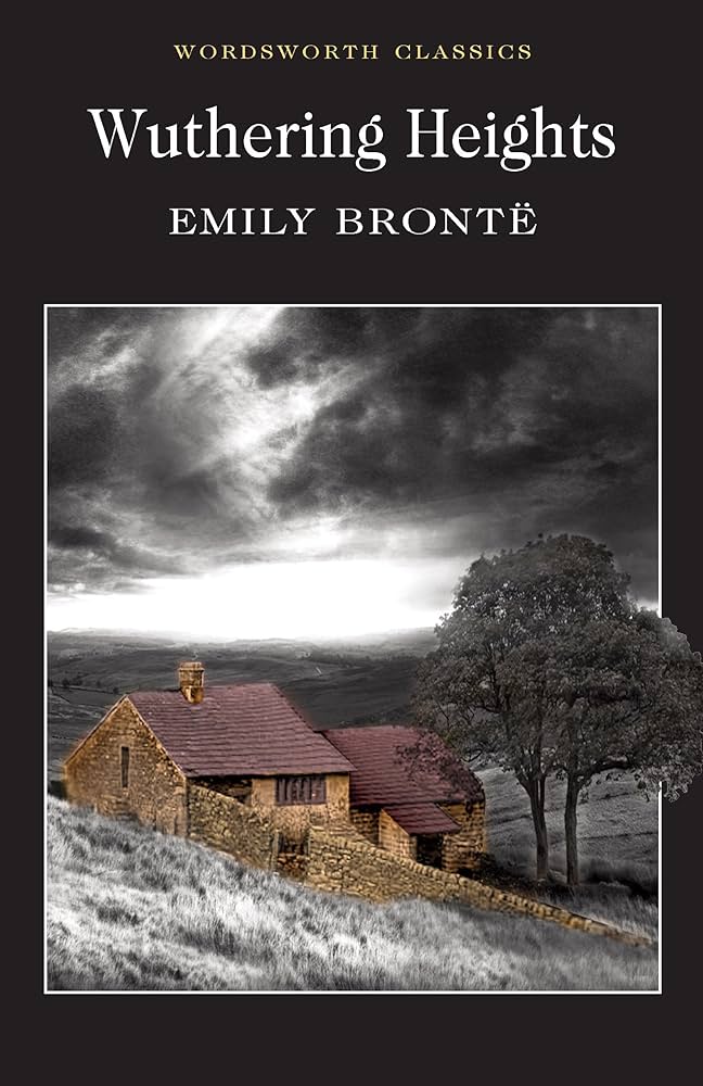
figure 2. https://m.media-amazon.com/images/I/81VQ3QFl04L.UF1000,1000_QL80.jpg
Title: Wuthering heights
Author: Emily Bronte
Let’s look at the original cover of Withering heights by Emily Bronte. this classical romance novel has so many covers design over the years , but some early editions featured designs that didn’t effectively convey the novels intense and gothic themes.
The early 20th century edition one of the first edition that depicted the pastoral scene with rolling hills and a quaint cottage.this imagery might seem fitting for a country side setting but it doesn’t really capture the dark, tumultuous nature of the story and its character.
Withering height is known for its deep feelings, nuanced characters, and ominous atmosphere. The characteristics are not exactly reflected in the pastoral cover design, which features tranquil and quiet imagery. Rather, it conveys the idea of a soft, bucolic rural romance, which is deceptive for prospective readers who re not aware with the true substance of the work.
The cover does not capture the gothic aspects that are really crucial to the work.the novel revolves around the themes of desire, retribution, and paranormal events; a more compelling cover design would allude to these qualities visually. A stormy setting, an ominous mansion, or a shadowy figure, for example would better capture the gothic tone of the book.
The pastoral cover design can be really misleading and it’s possible to confuse the genre. *Wuthering Heights* is a gothic novel with aspects of psychological complexity and tragedy,not only a romance. Because the book’s beautiful picture falls short to convey these genre characteristics, readers who may be drawn to its darker themes may choose to ignore it.
Despite its visual attractiveness that pastoral cover of Wuthering Heights fails to capture the deep feelings, gothic undertones, and intricate themes of the book. a more well considered cover would better convey the substance of the narrative and appeal to the target audience.
Reference list
Figure 1
- Amazon. Zhi by Boris Pasternak. Available at: https://m.mediaamazon.com/images/I/71BUj7cATPL.AC_UF894,1000_QL80.jpg (Accessed: 24 October 2024).
figure 2.
2. Bronte, E. (1996) Wuthering Heights (Wordsworth Classics) ebook : Brontë, Emily: Amazon.co.uk: Kindle Store, Wuthering Heights (Wordsworth Classics) eBook : Brontë, Emily: Amazon.co.uk: Kindle Store. Available at: https://www.amazon.co.uk/Wuthering-Heights-Wordsworth-Classics-Bront%C3%AB-ebook/dp/B00I0609SE (Accessed: 26 October 2024).