Three Cover Designs
For my three cover designs, I demonstrated continuity across consecutive issues. My goal is to keep a consistent branding system for the masthead, typography, colour tone and grid as mentioned in the instructions while allowing each cover to communicate a slightly different mood. The overall aesthetic is vintage luxury minimalism: restrained layouts, confident typography, and photography that feels nostalgic rather than highly saturated or digital.
Across all three covers, I kept the same structural logic: the masthead sits as the primary identifier, supported by a small set of cover lines and issue details aligned to consistent margins. I used framing and rule lines to connect the covers to my editorial spreads, and I kept spacing generous so the covers feel premium rather than cluttered. This consistent grid allowed the series to look like one publication, even as imagery changed.
As for the typography layout text, we were asked to use text in our editorial pages to make the cover designs, so I included them all on the design layout.
I used Amandine for the masthead and main headline presence because it gives the publication a distinctive, high-end editorial voice. Gotham Black was used for functional information and supporting lines where clarity matters most, and Playfair Display appears where a softer editorial tone was needed (small captions or supporting lines). I refined the hierarchy by controlling scale and spacing: the masthead is always dominant, secondary cover lines are smaller and aligned, and the smallest text is reserved for credits/issue details so it doesn’t compete with the image. In each of the cover designs, the body texts, header texts and headline texts were all used to create these covers.
Cover 1: nostalgic object still-life
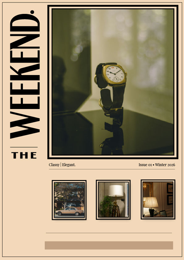
My design thought process for the first cover leans into quiet luxury through a still-life image (a watch) and a restrained layout. I used steady alignment and framing to treat the picture as a carefully chosen item. I used the font Amadine for this cover and was trying to make it more like a gallery cover design. For the body text. I used Playfair Display, so it gives it a clean and neat look and not overly clustered words. With the masthead at the top and supporting text spaced consistently, the typeface is layered to feel journalistic rather than poster-like. I also used the colour apricot for the background, so it really leans towards the vintage look. This cover establishes the general tone of the series and conveys “timelessness” while maintaining a very distinct vintage luxury minimalism; this truly works well with my designs.
Cover 2: rainy street nostalgia
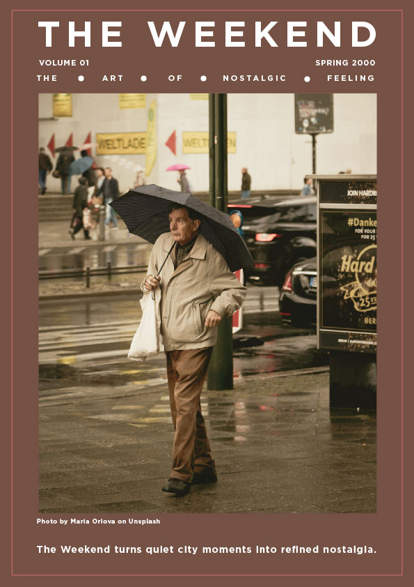
In order to inspire peaceful, contemplative city weekends, the second cover has a street shot with an umbrella and rain.
It is designed to evoke a sense of nostalgia and transport us back in time to a period when we could smell the rain; it reminds us of how the weekends made us feel; it puts us in a snug, warm atmosphere and is still extremely vintage while maintaining minimalism.
For the text, I used Gotham Black to give it a bolder look, but not so bold that it almost looks like a heading. I kept the text size very minimal, 10 – 13 pt.
To make the masthead readable against a darker background, I changed the tonal balance while keeping the same masthead and margin structure. This cover is more “moment-led” than “object-led, demonstrating the brand’s ability to remain constant while adjusting to various photography moods.
Cover 3: variation within the system
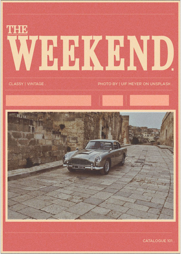
The third cover was one of my favourites, as it got a lot of good feedback, and it really communicates the vintage luxury minimalism, still giving the mood of old rich elegance and exploring variation while keeping the same rules. I used the text font Playfair Display, so it gives a very clean and coordinated look. This was the only cover design I used with one text font, and it makes it look so minimalist, which makes me love this cover very much. I also added a texture grain that I created myself in Illustrator using a rough, hard brush to give it the old-time look. I also added a frame around it so it really connects to my main purpose for this assignment. I kept the masthead consistent but changed composition emphasis (image cropping and negative space) to create a fresh issue feel. The key decision was to keep type placement aligned to the same grid so the viewer still recognises it as The Weekend immediately.
Refinement and improvements
Across the set, I refined contrast, spacing and alignment so the covers feel cohesive and professionally art-directed. I also ensured any small text remained legible by avoiding overly thin type on busy imagery and using calmer areas of the photograph for text placement.
References
1. Lupton, E. (2014). Thinking with Type. 2nd edn. New York: Princeton Architectural Press.
2. Unsplash contributors (n.d.) Photographs used on covers.