For this project, I used the typographical and branding template kit that was provided for my editorial magazine concept. The purpose of the standards was to make sure every output masthead, cover, and editorial spread looks like it belongs to one recognisable publication. My direction is “vintage luxury minimalism”: calm layouts, confident typography, warm neutrals, and carefully controlled spacing. Instead of filling pages with decoration, I used restraint, alignment and repetition to create a premium finish that still feels creative and editorial.
For this branding kit, I showed my design process and all the images I had used for my design work. All through my design, I was trying to put out a very nostalgic vibe; as we grow older, we always tend to think back about the memories that we had while young. This is one of my reasons why I chose vintage, and for luxury, what is much better than vintage luxury? Connecting with the old rich is one of the best things, one of the reasons why my audience is much older
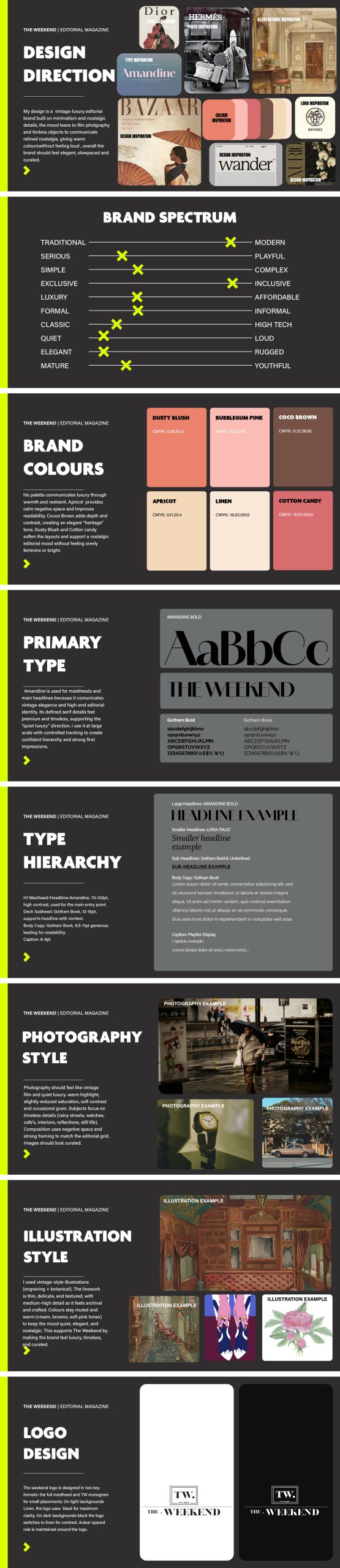
My designs are designed for readers who enjoy curated, reflective weekend culture: slow city moments, nostalgic photography, and calm long-form reading. I positioned the brand as classic, elegant and structured. This decision affected every standard: consistent margins, a stable grid, minimal colour accents, and a hierarchy that guides the reader from headline to body to caption without visual noise.
Typography standards
My type system uses three fonts to create contrast and hierarchy:
• Amandine (Headlines / Masthead): chosen for its editorial personality and vintage elegance. I use it for H1 moments where the brand needs a signature voice.
• Gotham Black (Body): chosen for clarity and structure. It balances the decorative headline font and keeps long-form text readable in columns.
• Playfair Display (Captions ): chosen to keep captions classic and refined while remaining distinct from body text.
Within the standards, I defined a hierarchy so the same “reading map” appears on every spread: H1 headline, subhead/standfirst, body copy, pull quote, then captions/credits. I also noted legibility rules: avoid placing small text directly on busy imagery; use panels or calmer backgrounds; and keep line length and leading comfortable for reading. These checks helped me keep the magazine usable when exported for WordPress viewing.
Colour palette standards (CMYK)
To maintain a warm, premium tone, I used a restrained CMYK palette:
• Apricot: CMYK 16/2/100/0 (sparingly for highlights)
• Linen: CMYK 0/11/25/4 (main background / negative space)
• Coco brown: CMYK 0/37/38/65 (strong contrast and borders)
• Bubble gum pink: CMYK 0/31/21/0 (caption panels / soft emphasis)
• Cotton candy: CMYK 0/58/53/4 (secondary panels and accents)
Colour palette standards (RGB)
• Apricot: CMYK 16/2/100/0 — RGB 214/250/0 — HEX #D6FA00
• Linen: CMYK 0/11/25/4 — RGB 245/218/184 — HEX #F5DAB8
• Coco brown: CMYK 0/37/38/65 — RGB 89/56/55 — HEX #593837
• Bubble gum pink: CMYK 0/31/21/0 — RGB 255/176/201 — HEX #FFB0C9
• Cotton candy: CMYK 0/58/53/4 — RGB 245/103/115 — HEX #F56773
Layout rules and brand elements
The standards include consistent border weights, rule lines, caption panel padding, and a grid logic that keeps alignment consistent across spreads. I also defined logo usage rules: the masthead should not be stretched or warped; it must keep clear space around it; and it should switch to a light version on dark backgrounds for readability. These decisions were tested across my three covers and my editorial pages to ensure the system works in real application.
References (Hull Harvard)
Bringhurst, R. (2013) The Elements of Typographic Style. 4th edn. Vancouver: Hartley & Marks.
Lupton, E. (2014). Thinking with Type. 2nd edn. New York: Princeton Architectural Press.