INTRODUCTION
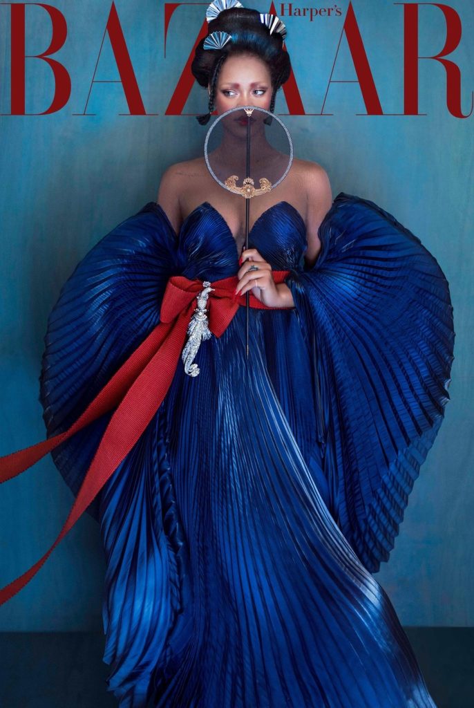
Harper’s Bazaar China (2019) “Rihanna Red Beauty” cover, photographed by Chen Man.
https://www.irisvanherpen.com/news/rihanna-on-the-cover-of-harpers-bazaar-china
A great example of how colour can be used to convey cultural and emotional narratives in addition to aesthetic appeal is the Harper’s Bazaar China cover for “Rihanna Red Beauty” (November 2019). The composition, which was captured by Chen Man, combines gold, white, and red in a pleasing triadic palette that strikes a balance between refinement and intensity. The image’s emotional core is formed by the predominant red background, which in Chinese culture represents power, passion, and prosperity. White type and strategically placed gold accessories create contrasting focal points that preserve visual rhythm, while Rihanna’s red outfit blends in perfectly with the background, fostering unity through analogous harmony (Wong, 1993).
To direct the audience’s eye, the designer uses colour structure: the Red masthead adds clarity, the gold and silver highlights add dimensional richness, and the warm red tones demand attention right away. The subject is kept separate but integrated with the background thanks to the palette’s clear figure-ground relationships. Samara (2014) asserts that in order to maintain coherence, effective colour design employs controlled contrast and proportion; this cover perfectly demonstrates this idea by striking a balance between neutral highlights and saturated primaries.
In Chinese visual tradition, red and gold are highly symbolic colours that stand for luck, celebration, and success. The cover unites Eastern visual codes with Western celebrity imagery, bridging cross-cultural aesthetics by fusing this symbolism with Rihanna’s modern global identity. This duality exemplifies semantic colour, which is defined by Ambrose and Harris (2019) as hue that conveys layered meaning beyond decoration. All things considered, the cover exhibits exquisite chromatic balance, bringing together composition, culture, and brand identity with a purposeful and emotionally stirring use of colour.
weak Example
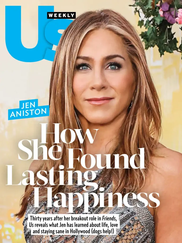
Us Weekly (2023) Jennifer Aniston “How She Found Lasting Happiness”
Jennifer Aniston’s cover for Us Weekly in 2023 lacks a consistent colour scheme and tonal harmony. The cover features white serif typography, a warm beige-gold background, and a vibrant cyan-blue masthead. Although each of these colours is appealing on its own, when used together, they create chromatic discord. The cold tone of the blue masthead visually distances it from the warm background and the natural skin tones of the subject, making the composition less cohesive. Furthermore, there is less visual hierarchy and legibility because the white headline overlaps with the lighter portions of the image. This disparity results in a haphazard effect that is unable to convey harmony between typography and imagery.
When positioned over lighter portions of the image, the white headline reduces readability and contrast. The words seem to fade rather than stand out because the background and text have little tonal variation. Wong (1993) asserts that effective figure-ground distinction requires clarity of contrast, which this cover does not accomplish. Additionally, there is no unifying temperature relationship between the cool and warm tones, which Ambrose and Harris (2019) define as a fundamental component of colour coherence in design. The portrait’s serene colour scheme is overpowered by the masthead’s brightness and saturation, which produces a visual tension that detracts from the subject.
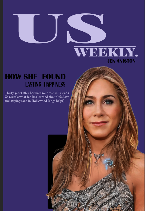
The original problem of inconsistent colour temperatures and low contrast is fixed in the redesign of the Us Weekly (2023) cover. A subdued lavender-navy colour scheme was used in place of the bright cyan masthead, bringing the model’s warm skin tones into balance with the cooler background. A more straightforward colour scheme of white, black, and grey brought the typography together, making it easier to read and comprehend. The viewer’s attention is now naturally directed from masthead to portrait by a subtle tonal contrast. The cover is transformed into a unified, emotionally serene composition by the restrained use of colour and consistent tonal relationships, which convey balance and sophistication. This redesign serves as an example of how careful temperature control and colour selection can improve editorial communication and restore visual coherence.
Reference List
Ambrose, G. and Harris, P. (2019) Colour Theory. In: The Fundamentals of Typography. 3rd edn. London: Bloomsbury.
Harper’s Bazaar China (2019) Rihanna “Red Beauty” Cover – November Issue. [Online image]. Available at: https://www.irisvanherpen.com/news/rihanna-on-the-cover-of-harpers-bazaar-china (Accessed: 10 November 2025).
Samara, T. (2014) Making and Breaking the Grid: A Graphic Design Layout Workshop. 2nd edn. Beverly, MA: Rockport Publishers.
Wong, W. (1993) Principles of Form and Design. New York: Van Nostrand Reinhold.
Us Weekly (2023) Jennifer Aniston – “How She Found Lasting Happiness” cover. [Online image]. Available at: https://www.usmagazine.com/style/news/jennifer-aniston-shares-how-she-found-lasting-happiness-in-us-weekly-cover-story/ (Accessed: 10 November 2025).