Apartamento x Belmond “El Bajío”
Strong Example of Effective Typography
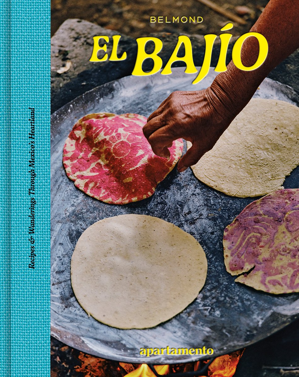
Typography plays a central role in establishing tone, identity, and narrative coherence within editorial design. The Apartamento x Belmond – El Bajío issue (2022) exemplifies how typographic decision-making can reflect both cultural context and brand consistency.
The Apartamento magazine masthead font is a lowercase serif typeface, simple and easily recognizable, which helps create visual coherence between issues and communicates the subtle flavour of the editorial text. (Apartamento Magazine, 2022). Positioned subtly at the bottom right, the logotype maintains legibility while deferring visual dominance to the vivid photographic subject matter, a hand preparing tortillas over open flame.
The title “El Bajío” is set in a bold display typeface, creating a contrasting rhythmic typographical effect. The curved letterforms effectively reflect the textures of the background, conveying a sense of handcrafted craftsmanship and regional heritage. The very pigmented yellow colour creates a warm harmony with the image’s ingrained browns and reds, ensuring coherence and emphasis. The typography stacking is demonstrating its hierarchy between the basic Apartamento logo, the expressive title, and the small Belond mark. Every component fulfills a unique communication purpose without upsetting the composition’s harmony.
This example demonstrates that effective editorial typography relies on cultural depth and subject awareness rather than decorative elements. El Bajío thoughtfully blends serif and display forms, varies sizes, and preserves tonal consistency to produce a design that is both visually disciplined and contextually appropriate. By complementing rather than competing with the visual, the font demonstrates a competent knowledge of typographic harmony and narrative alignment.
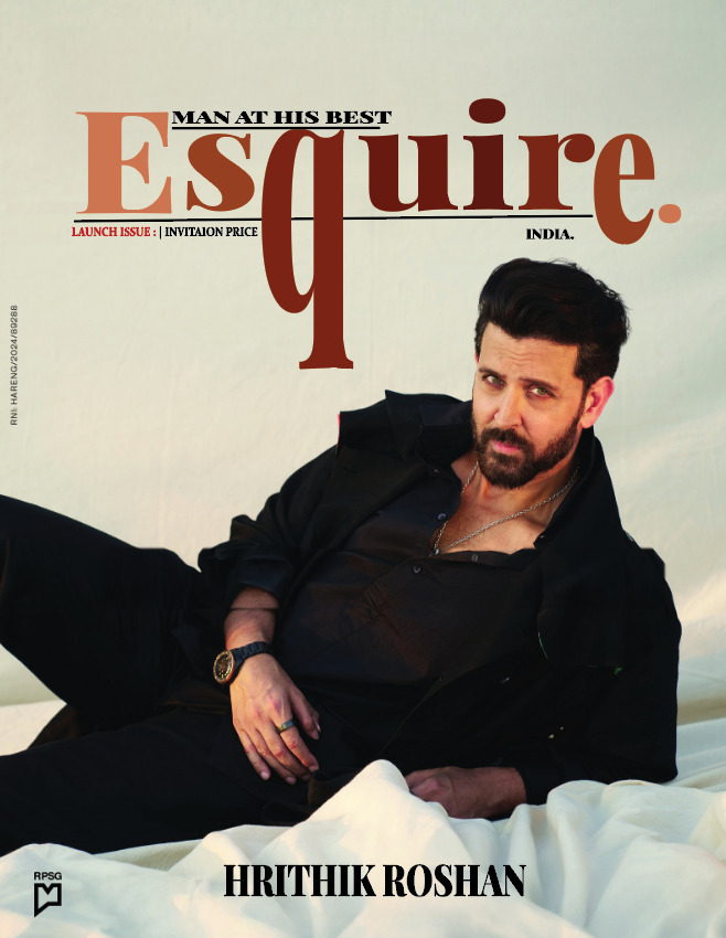
Weak Example
Esquire India (2024) launch issue featuring Hrithik Roshan. Source: Esquire India.
The original Esquire India launch cover featuring Hrithik RoshanThere is a lack of consistency in the typographic hierarchy and legibility of the original magazine. Although the brand’s classic wordmark is used on the masthead, its impact is diminished by an uneven brown-to-orange gradient that lessens the tonal contrast with the cream background. Awkwardly floating across the subject’s torso, the tagline “man at his best” results in inadequate tension between image and text and poor spatial alignment. A distinct “reading path” that guides attention through hierarchy and spacing is essential for effective editorial typography, claim Ambrose and Harris (2019). Hierarchy breaks down in this design because the actor’s name, tagline, and masthead vie for attention rather than following a set order.
redesign of Esquire India cover (2025). Created in Adobe Illustrator.
The amended version makes use of typographic discipline to enhance balance and readability. Using a single warm brown hue, the masthead maintains Esquire’s iconic shape to enhance colour consistency and brand coherence. By adding a full stop, a subtle technique commonly used in contemporary editorial branding to convey assurance and accuracy, Esquire gives the logotype visual closure (Lupton, 2010). The uppercase tagline has been shifted above the masthead to align with the vertical axis of the extended “q.” This change maintains hierarchy and embodies the typographic alignment principle that Cheng (2020) found to be crucial for compositional harmony.
Additional refinements include the enlargement of the actor’s name at the base of the frame to anchor the design and the removal of excessive tracking in the tagline to achieve rhythm. Together, these interventions demonstrate a considered application of typographic hierarchy, tonal contrast, and spatial logic. The redesign elevates the cover from a decorative arrangement to a coherent editorial statement where typography and imagery coexist in functional equilibrium.
REFERENCES LIST
Ambrose, G. & Harris, P. (2019). The Fundamentals of Typography. 3rd edn. London: Bloomsbury Visual Arts.
Apartamento Magazine (2022) Apartamento x Belmond: El Bajío. [Online image]. Available at: ht ps://www.apartamentomagazine.com/product/el-bajio-belmond/ (Accessed: 9 November 2025).
Cheng, K. (2020). Designing Type. Nd edn. New Haven: Yale University Press.
Ambrose, G. and Harris, P. (2019) The Fundamentals of Typography. 3rd edn. London: Bloomsbury Visual Arts.
Cheng, K. (2020) Designing Type. 2nd edn. New Haven: Yale University Press.
Esquire India (2024) Launch Issue featuring Hrithik Roshan. [Online image]. Available at: https://www.esquireindia.com (Accessed: 10 November 2025).
Lupton, E. (2010). Thinking with Type: A Critical Guide for Designers, Writers, Editors, and Students. 2nd edn. New York: Prince on Architectural Press.
Lupton, E. (2010) Thinking with Type: A Critical Guide for Designers, Writers, Editors, and Students. 2nd edn. New York: Princeton Architectural Press.