INTRODUCTION
Conceptual design is a main aspect of graphic design, and it focuses on conveying meaning and identity through the elements of visuals. The primary visual is the logo or title that appears on every magazine design; it’s more than just design and adding symbolic meaning, and it communicates its values and audience at a glance.
This post explores the importance of conceptual design in magazine mastheads by analyzing two contrasting examples.
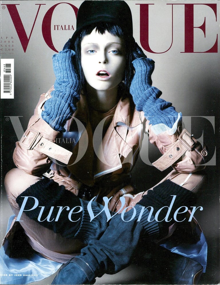
The cover from the Vogue magazine “Vogue Italia” is a really great example of strong conceptual design and how a masthead can add more story to the magazine; it enhances the whole design. The bold red Vogue font at the top is very visible, and the smaller font Italia inside the “o” of Vogue is not too bright but very visible, and you can still see the model in the picture clearly focusing its attention on both the balanced texture and the balanced texture of the clothing.
The masthead works well with the image. The classic red serif font is strong, and the transparent overlay adds depth without making the design too busy.
The supporting text matters too: “pure wonder” in soft blue and white adds a nice sky blue contrast, and the John Galliano photo credit gives the piece an editorial weight. It’s more of a vibe than just a cover.
This conceptual design works well because it’s carefully thought out. Every part—color, placement, and type—serves a purpose. As Massimo Vignelli said, “Design is how it works.” The masthead succeeds here by blending visual appeal, storytelling, and branding.
Vogue Italia proves how a clever masthead design can boost a magazine’s character. To show the difference, I’ll now check out a weaker example where the masthead isn’t coherent, original, or in sync with the magazine’s vibe, and I’ll talk about how it could be improved.
Weak Example of Conceptual Design.
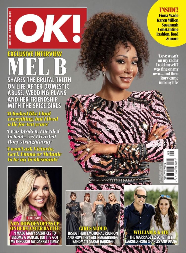
In contrast, the OK! Magazine cover demonstrates a weak conceptual approach. The masthead’s bold red block with white sans-serif text is instantly recognizable, but it prioritizes brand visibility over creative meaning. The cover layout uses heavy text boxes, clashing colors, and multiple focal points, creating a visually crowded composition that overwhelms rather than engages. The typography lacks nuance or emotional tone, serving only as information delivery rather than conceptual expression.
Unlike Vogue’s thematic coherence, this design offers no underlying idea or visual metaphor. Each element competes for attention—headlines, celebrity photos, and captions fight for space, resulting in a layout that reflects commercial urgency rather than editorial storytelling. According to Ambrose and Harris (2019), effective masthead design should balance identity and communication through hierarchy, contrast, and context. OK! The magazine’s masthead is static and formulaic, showing little evolution or engagement with design principles.
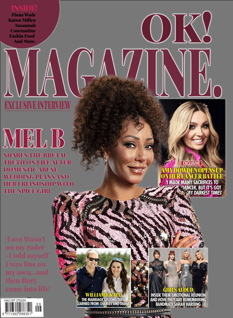
Redesign: Conceptual Improvement.
In my redesign, I aimed to give the composition a conceptual identity that conveys sophistication and emotional tone while maintaining recognizability. Using Adobe Photoshop, I replaced the harsh red with a deep purplish-red gradient, symbolizing confidence, luxury, and femininity. The typography was adjusted for better kerning and proportional balance, giving the masthead more rhythm and clarity.
The simplified layout allows the masthead to dominate meaningfully, creating visual hierarchy and emotional focus. Instead of cluttered text boxes, I prioritized negative space and color harmony to guide the viewer’s eye. These decisions reflect Gestalt principles of unity and emphasis, transforming the design from a commercial template into a conceptually expressive cover. The redesign communicates a distinct personality — one that blends elegance with strength—and aligns with the principles of editorial storytelling found in successful conceptual designs like Vogue Italia’s.
REFERENCE
2. Faisal, E. (n.d.). Masthead Analysis. Available at: https://sites.google.com/view/emaana1media/research/masthead-analysis [Accessed 26 Oct. 2025].
3. Vignelli, M. (2009). The Vignelli Canon. Baden: Lars Müller Publishers.
4. Ambrose, G. and Harris, P. (2019) The Fundamentals of Graphic Design. 3rd ed. London: Bloomsbury Visual Arts.
5. Lupton, E. (2010) Thinking with Type: A Critical Guide for Designers, Writers, Editors, & Students. 2nd ed. New York: Princeton Architectural Press.
6. Vogue Italia (2020) No Photoshoot Issue. March 2020. [Online]. Available at: https://www.vogue.it/en (Accessed: 7 November 2025).