The mood board for my Rock in Rio app was developed with the intention of capturing the vibrant, high-energy atmosphere of a global music festival while maintaining a sleek, modern interface that appeals to a young audience. Drawing inspiration from iconic festivals such as Tomorrowland and Coachella, I focused on creating a visual identity that combines bold colors, striking imagery, and dynamic layouts. The mood board brings together references of live performances, festival lighting, crowd energy, and stage designs, all of which influenced the look and feel of my app. This visual basis made it possible to guarantee that the Rock in Rio platform’s design components are unified and accurately represent the festival’s vibrant and dynamic identity.
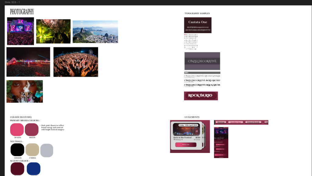
My choice of font was also influenced by the mood board. Cherry Cream Soda and Cantata One, the fonts used in the Rock in Rio app, were chosen to capture the vibrant, joyous spirit of the festival. Headings and important titles use Cantata One’s bold and elegant serif design, which lends the app a sense of refinement and ororganization.onversely, Cherry Cream Soda gives a light-hearted and contemporary vibe that is ideal for interactive buttons and labels. When combined, these typefaces create a distinctive visual identity that complements the festival’s imaginative and vibrant brand.
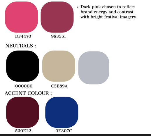
When designing the Rock in Rio app, I wanted the color palette to capture the energy and atmosphere of the festival while keeping everything clean, modern, and easy to use. I decided to focus on just a few strong colors—mainly deep pink, burgundy, and black—with soft beige used for highlights. This simple but bold combination helps create a clear identity for the app while avoiding unnecessary visual clutter. By keeping the palette minimal, the interface feels cohesive and professional but still vibrant and exciting.
The app’s intentional usage of a dark theme as its base was motivated by both functional and aesthetic factors. In addition to being sleek and modern, dark backgrounds have grown in popularity in modern design because they lessen eye strain, especially for users accessing the app in dimly lit festival settings. In order to make the vivid event imagery, artist photos, and interactive elements (such as the “Book Now” and “Tickets” buttons) stand out more, the dark tones create a cinematic atmosphere. The most crucial components will automatically attract the user’s attention thanks to this high-contrast technique, which also keeps the layout visually coherent.
During development, I realized that sticking to only three colors sometimes created small challenges. For example, when integrating high-quality images of the festival stages and performers, some visuals clashed with the pink tones. This made certain interactive buttons or details harder to see. To fix this, I introduced a neutral beige as a subtle background for sections like the ticket cards. It helped create contrast without disrupting the overall style. This little addition made the interface feel more balanced while giving the design some breathing room.
Overall, the color planning was designed with both functionality and emotional impact in mind. By combining a dark festival-inspired aesthetic with a limited but powerful palette of deep pink, burgundy, and black, the app strikes the perfect balance between modern minimalism and energetic vibrancy. It provides a visually striking yet easy-to-navigate interface that aligns perfectly with the essence of Rock in Rio—music, passion, and unforgettable experiences.