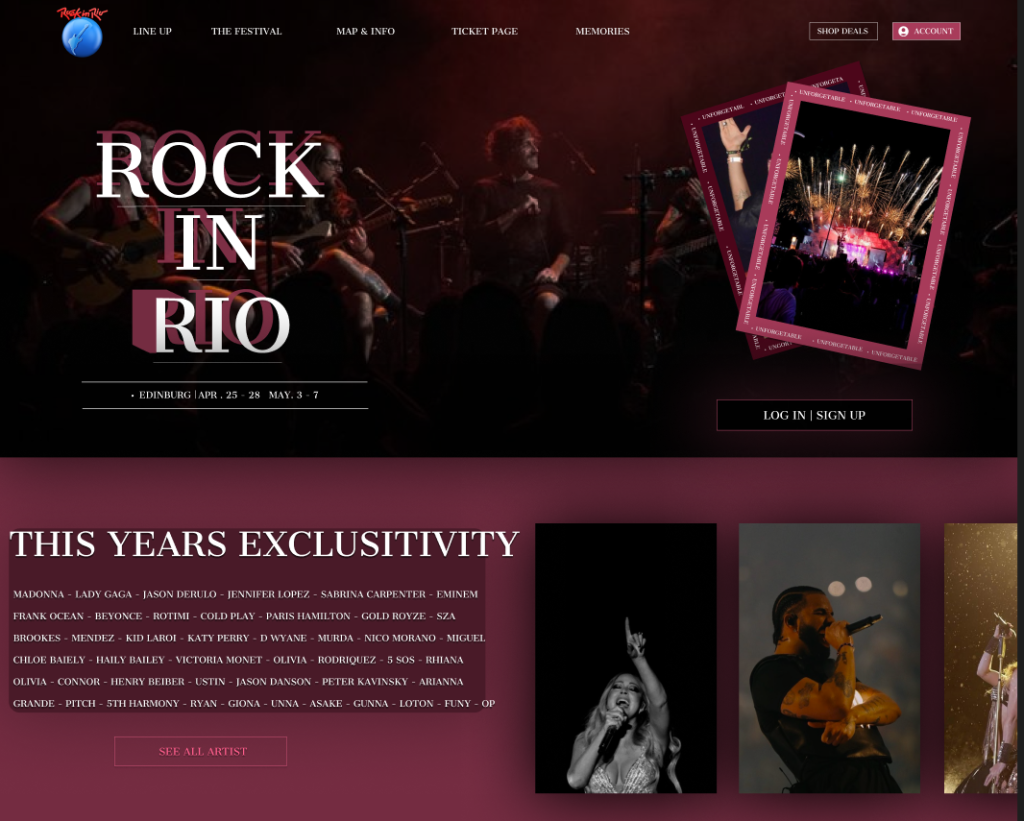
This stage focuses on developing mid- to high-fidelity layouts for the Rock in Rio website and companion app, translating the visual identity from the mood boards into structured, responsive designs. Using Figma, I built prototypes that adapt seamlessly across devices, ensuring a consistent user experience (UX) for mobile and desktop.
In the Rock in Rio companion app design, every UI element and visual asset on the canvas has been intentionally crafted to serve a specific purpose. Each button, icon, and interactive feature has been positioned with user flow and usability in mind, avoiding any unnecessary or decorative elements that do not contribute to the user journey. The layout leverages psychological principles, such as visual hierarchy and familiarity, ensuring that users can intuitively navigate the app without confusion. For instance, the placement of the bottom navigation bar, ticket access button, and lineup cards are based on patterns that users already recognize from popular music festival apps, allowing them to quickly adapt. Rather than focusing solely on the visual style, every decision made in this design is rooted in functionality and user expectations, ensuring that the interface feels both engaging and purposeful.
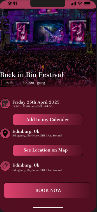
In the Rock in Rio app, the placement of the main logo at the top left corner of both the website and app interface is a deliberate choice to create a sense of brand consistency and user familiarity. This placement serves as a visual anchor and a reliable “home” button, allowing users to quickly return to the homepage or reset their navigation journey with ease. Given that most digital interfaces adopt this pattern, users intuitively understand its function. For a festival platform like Rock in Rio, where attendees may need to move between different sections—such as the lineup, tickets, or maps—this design choice reduces friction and builds trust by keeping the logo highly visible.
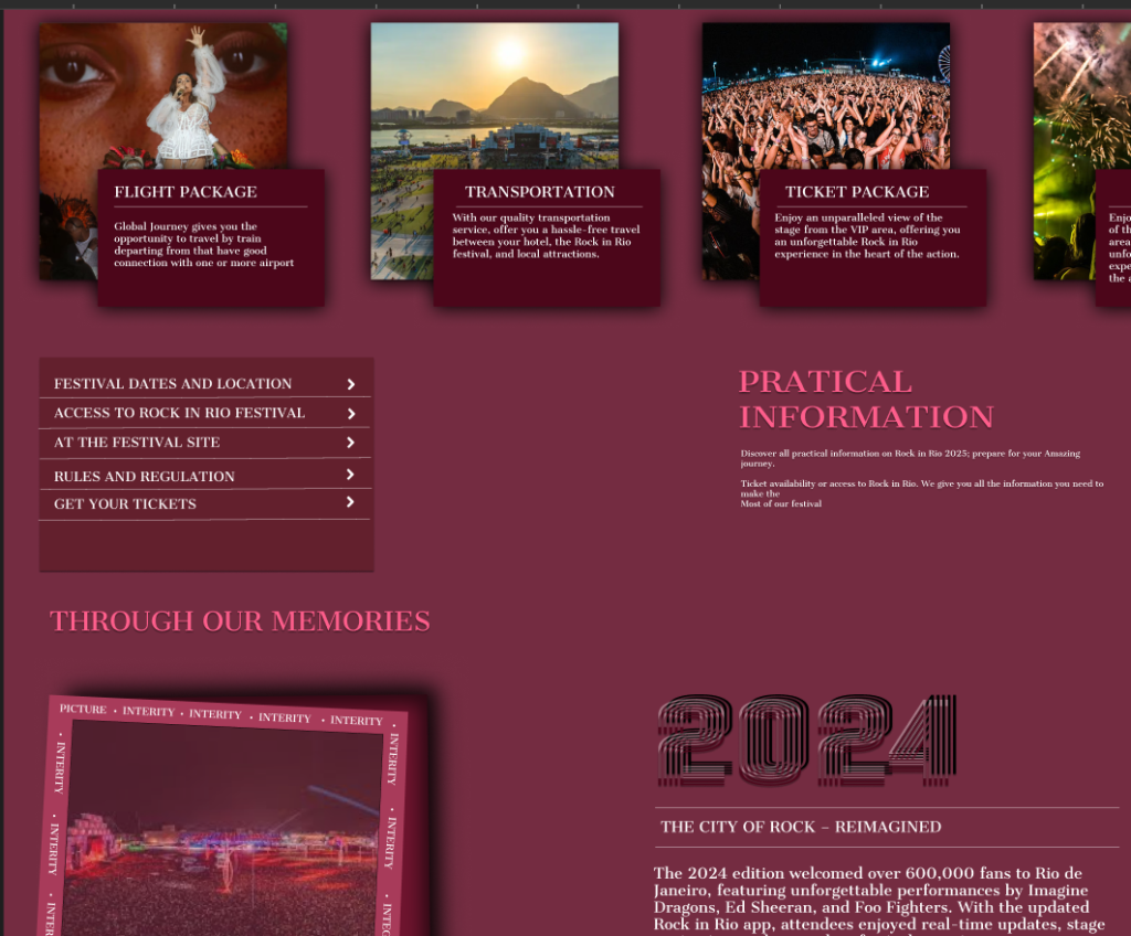
Navigation elements, particularly those tied to essential user actions like purchasing tickets, have been given heightened visual importance. On the app, the “Tickets” button is designed with a bold and contrasting pink tone that instantly captures attention against the darker background palette. This visual hierarchy ensures that the most critical user goals, such as booking tickets or checking event schedules, are highlighted and easy to find. The size and color contrast of this button not only enhance usability but also act as subtle psychological cues, signaling the user that this action is a priority.
The ticket purchase page follows a clean, structured layout that adapts fluidly to mobile devices without losing its distinctive aesthetic. The vertically stacked ticket options make navigation seamless on smaller screens, with the most affordable option placed at the top, gradually leading users to premium choices. The use of the pink gradient and off-white backgrounds maintains brand consistency while ensuring readability. Key details such as event date, location, and pricing are emphasized using bold typography and spacing, minimizing the risk of confusion during the purchase process.
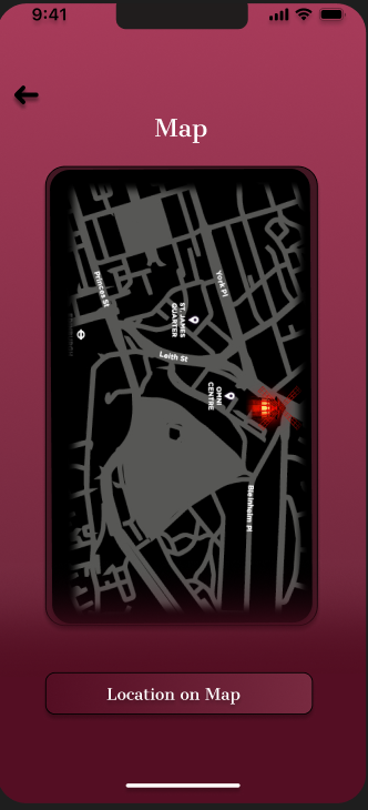
On the map screen, a minimalist black-and-white design with a standout location pin makes navigation intuitive. This ensures that festival attendees can quickly locate stages and event zones without overwhelming visual clutter. Similarly, the lineup and event schedule pages utilize a card-based layout with artist imagery and clear labels, making it easy to browse performers while maintaining a visually engaging flow. The bottom navigation bar remains consistent across all screens, providing quick access to primary features such as the homepage, lineup, and user profile.
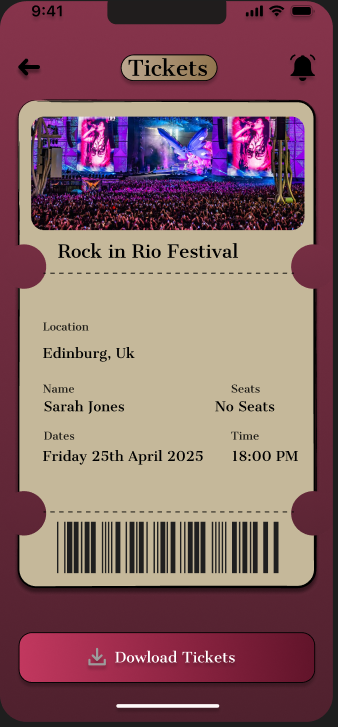
Finally, the use of a restricted color palette of deep pink, burgundy, and black throughout the interface reinforces brand identity while minimizing visual distractions. Each interactive element is thoughtfully highlighted, from the “Download Tickets” button on the ticket screen to the prominent “Book Now” option on the event details page. By maintaining consistency in button styles, font weights, and color treatments, the app delivers a smooth and intuitive user experience that aligns perfectly with the Rock in Rio brand.