Typography is a key element in shaping the visual identity and user experience of the Rock in Rio app. For this project, I made a deliberate choice to limit the design to two typefaces—Cantata One and Cherry Cream Soda in order to create a balanced and consistent interface. This approach was driven by the principle of visual clarity and brand cohesion, ensuring that the overall design remains both modern and user-friendly. By focusing on only two fonts, the app avoids the visual clutter that often comes with using multiple typefaces, allowing users to easily navigate and engage with essential content like tickets, lineups, and festival schedules.
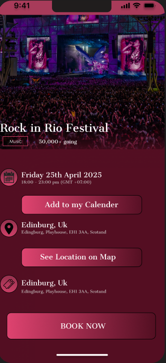
The primary typeface, Cantata One, is used across all major headings, artist names, and key sections. Cantata One is a serif typeface that combines elegance with excellent legibility, giving the app a premium feel while remaining functional across various screen sizes. Its clean letterforms and subtle stylistic details make it particularly effective for conveying important information without appearing overly decorative. By using Cantata One as the primary font, the Rock in Rio app establishes a clear visual hierarchy, ensuring that critical content such as ticket tiers, event titles, and lineup sections immediately stand out to users. Its high readability on both dark and light backgrounds complements the app’s dark pink and black color scheme, making headings pop while maintaining visual harmony.
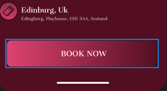
The Cantana one is applied to buttons, labels, and interactive call-to-action elements, adding personality and energy to the interface. Its rounded and slightly retro style aligns with the vibrant, celebratory atmosphere of Rock in Rio, while also drawing attention to key interactive areas like “Book Tickets,” “Explore Map,” or “Watch Live.” By using Cherry Cream Soda sparingly, the app avoids overwhelming the user, while ensuring that these high-priority elements feel distinct and inviting.
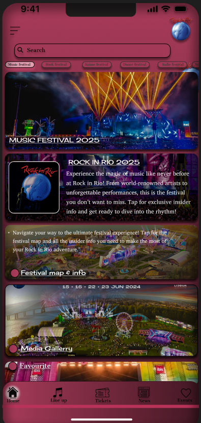
The combination of Cantata One and Cherry Cream Soda reflects a careful balance between professionalism and fun, which is essential for a festival as iconic as Rock in Rio. Cantata One delivers a sense of authority and sophistication, perfect for headings and structured content, whereas Cherry Cream Soda adds character and energy to highlight special features. This pairing was inspired by successful festival apps like Tomorrowland and Coachella, which also rely on a dominant clean font paired with an accent typeface for emphasis.
To optimize usability, font sizes and spacing were meticulously planned. Headings in Cantata One are bold and large enough to capture attention, while supporting text remains smaller but equally legible. Cherry Cream Soda is reserved for short, high-impact phrases, ensuring it remains effective and doesn’t compromise readability. This typographic strategy contributes to a smooth visual flow, guiding users naturally through the interface without causing unnecessary distractions.
The color palette of the app, featuring a dark theme with striking pink highlights, works seamlessly with these typefaces. Cantata One’s clean, bold serif contrasts beautifully with the dark backgrounds, creating a sharp and professional look, while Cherry Cream Soda adds a fun, playful tone that resonates with the festival’s energy. The pink accents highlight Cherry Cream Soda’s distinctive shapes, ensuring call-to-actions and labels stand out. Together, these fonts and colors create a vibrant yet functional design language that reflects Rock in Rio’s unique identity and modern style.