My main inspiration for the Rock in Rio festival app came from the digital user interfaces of well-known festivals Coachella and Tomorrowland. Both festivals are renowned for their innovative digital platforms that combine cutting-edge UI design with user-friendly usability in addition to their live music experiences. I closely examined these events’ visual techniques, drawing inspiration from their use of interactive components, bold typography, and immersive images to produce a distinctive and identifiable digital identity.
Tomorrowland’s incredibly creative and visually captivating images, intricate iconography, lovely captivating backgrounds are key components of both its website and mobile app, which immediately immerse consumers in the festival’s enchanted atmosphere. The Tomorrowland app also effectively employs layered text, subtly animated graphics, and vibrant colour schemes to create an entertaining and high-end experience. I took inspiration from this and used high-quality artist photos, dark backgrounds, and accent colours. While maintaining the legibility of the text and interaction elements, my design’s bright color schemes are homaged by the vibrant yet well-balanced usage of dark pink tones.
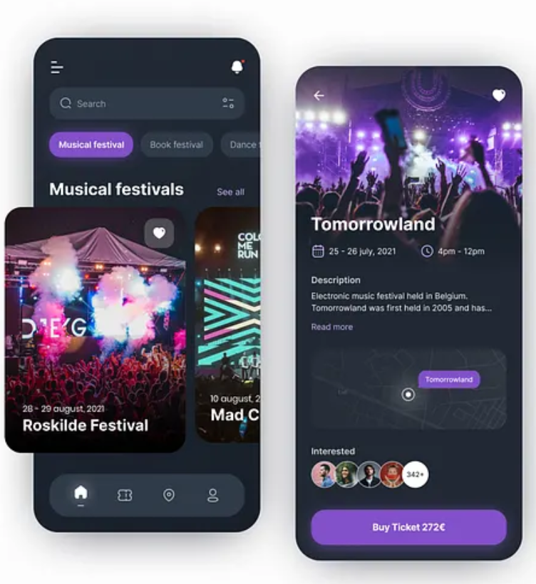
The Coachella app design has a more understated yet no less elegant style, which improves usage on all platforms. This gave me the idea to create a simple layout for my Rock in Rio app, making sure that every navigational element from the lineup and ticket purchasing sites to the login screen, is well-defined. Coachella also takes advantage of night-mode-inspired backdrops, which provide users a sleek, contemporary look while lessening eye strain. This had a direct impact on my choice to make the Rock in Rio app have a dark theme.
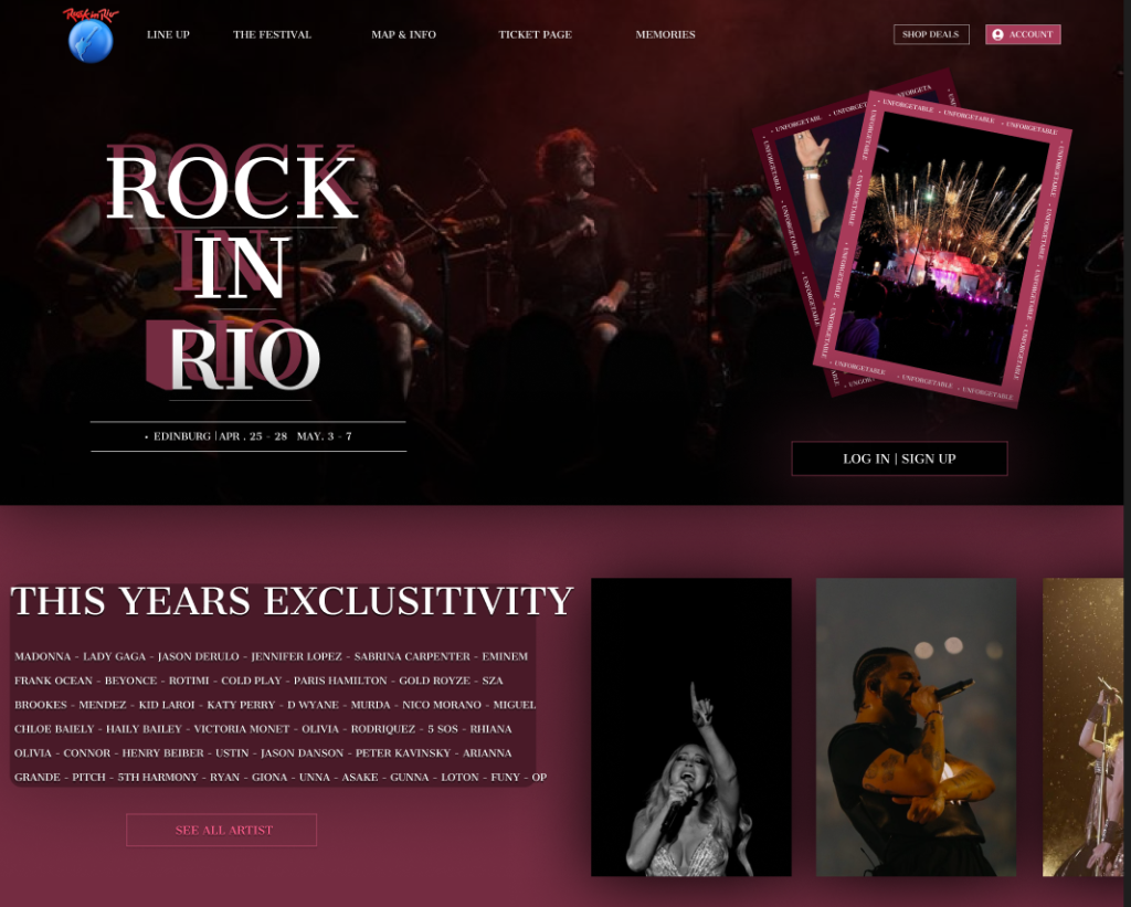
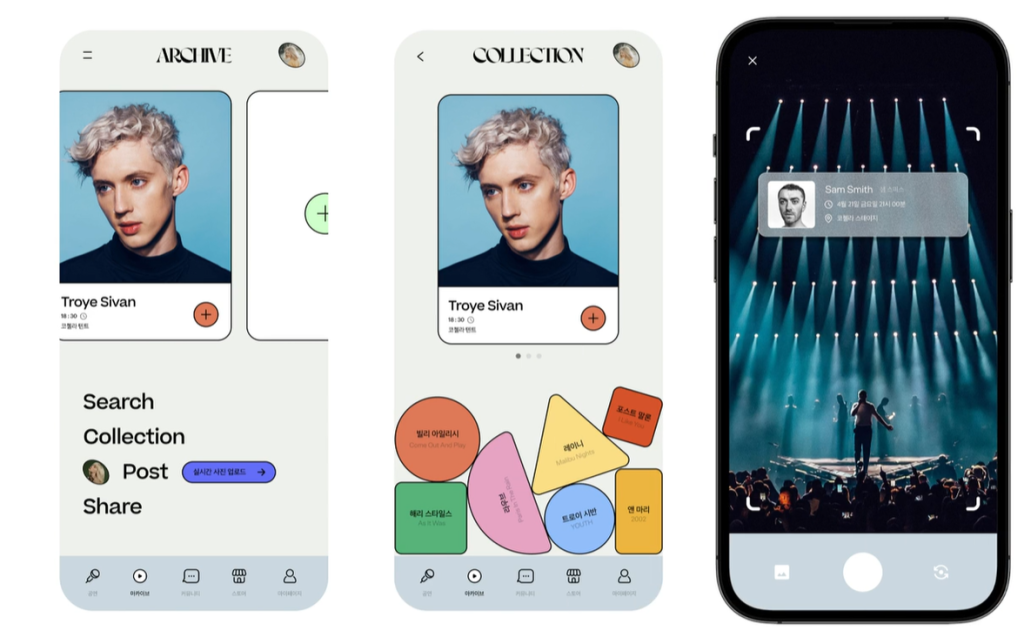
My design approach also focuses heavily on user engagement and recognizability. Similar to how Tomorrowland integrates fantasy-themed UI components and Coachella highlights its desert-inspired visuals, I ensured that the Rock in Rio app reflects the vibrant energy of the festival. The use of live performance imagery, event countdowns, and ticket previews creates a strong visual connection between the app and the real-world festival experience. For instance, my ticket screen uses a digital ticket design with a QR code, a concept inspired by Coachella’s ticketing system but customized with Rock in Rio’s branding.
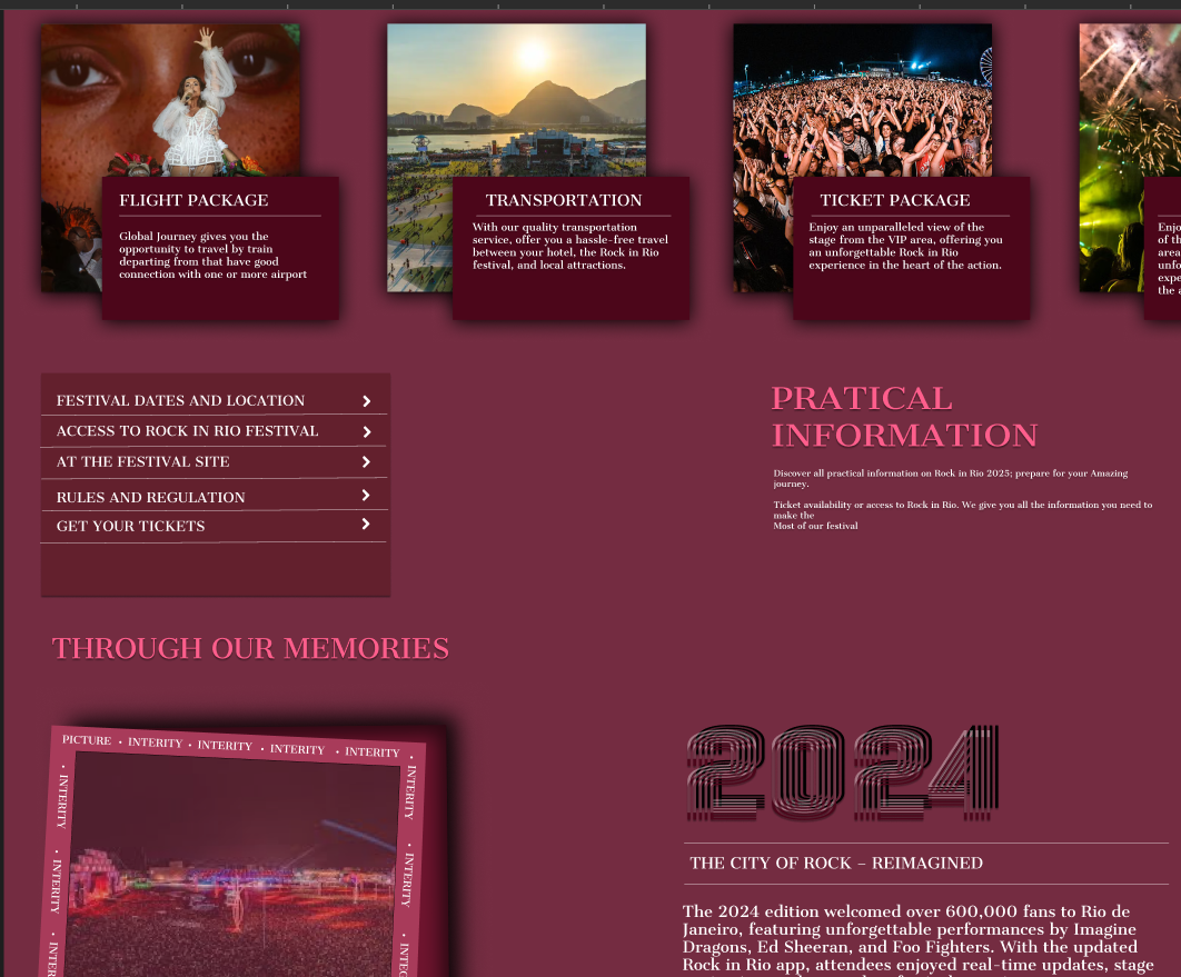
I used dynamic features like the lineup page and interactive map to let consumers easily organise their festival experience, just like Tomorrowland leverages its user interface to tell the story of the event. Coachella’s navigation features and contemporary mapping applications both had a direct influence on the map screen, which features a dark UI with highlighted pins to make it easy for users to navigate the event.
My Rock in Rio app strikes a balance between visual spectacle and usability by fusing Coachella’s elegant and simple design with Tomorrowland’s colorful, immersive user interface. In addition to capturing the spirit of the festival, the finished design follows current trends in digital design, guaranteeing a cutting-edge, intuitive experience that appeals to festival attendees between the ages of 18 and 35.
REFERENCE
- Tomorrowland
Tomorrowland (2024) Official Tomorrowland Festival Website. Available at: https://www.tomorrowland.com (Accessed: 18 July 2025). - Coachella
Coachella (2024) Official Coachella Valley Music and Arts Festival Website. Available at: https://www.coachella.com (Accessed: 18 July 2025). - Rock in Rio
Rock in Rio (2024) Official Rock in Rio Festival Website. Available at: https://rockinrio.com (Accessed: 18 July 2025). - Kovaleva, A. (2021) Festivals & Events App (UI concept). Dribbble. Available at: https://dribbble.com/shots/14923778-Festivals-Events-App (Accessed: 19 July 2025).