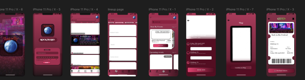
The low-fidelity prototype presented below serves as an early-stage wireframe for the Rock in Rio companion mobile app, laying the foundational structure for user flow and interaction design. The purpose of this prototype is to map out essential features and user journeys before applying detailed visuals or branding. This approach allows for rapid testing and iteration based on feedback while maintaining a clear focus on usability.
The wireframes demonstrate eight key screens: the splash screen, login page, home feed, lineup schedule, event discovery, event details, location map, and ticketing system. Each screen has been structured with clear user intent in mind. For instance, the home feed highlights top festival events and media, while the lineup page focuses on artist performance schedules in a scrollable card format. This makes it easier for users to explore events based on time, genre, or popularity.
Additionally, the event detail screen features essential CTAs (Call-to-Actions) such as “Add to Calendar,” “Book Now,” and “View on Map,” aligning with Jakob Nielsen’s usability heuristics for recognition, efficiency, and control. The map and ticket pages provide practical utility, helping users locate venues and securely access digital tickets via QR codes.
The bottom navigation bar remains consistent across all screens, enhancing orientation and accessibility. At this stage, the visuals remain intentionally minimal to prioritize layout, content hierarchy, and screen flow. Colour and branding will be refined in the high-fidelity design stage.
Overall, this low-fidelity prototype plays a vital role in validating the app’s structure and features. It ensures the core functionality is aligned with user expectations before visual styling is added. This iterative process supports user-centered design and reduces the risk of major changes during later development phases.