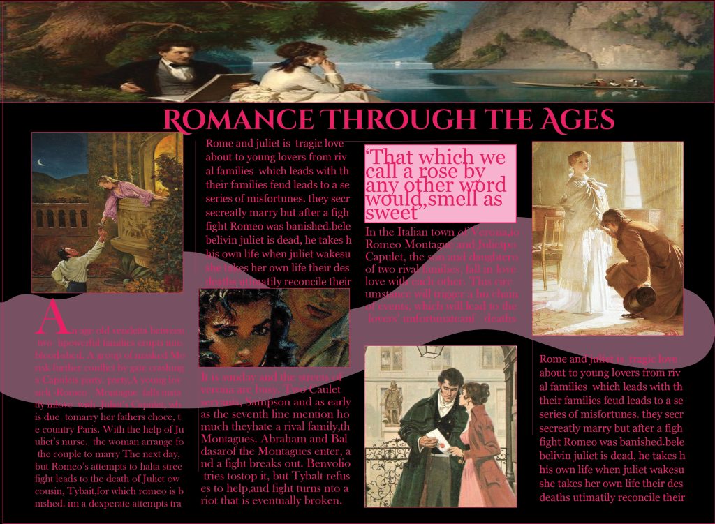
Romance Through the Ages: Conceptualizing the Editorial
“Romance Through the Ages” was created with inspiration from the classic romance novels’ everlasting appeal and Victorian art’s aesthetic appeal. By balancing font, colour, composition, and images, this editorial effort seeks to visually tell the essence of love legends like Romeo and Juliet. These components had to be carefully incorporated into the editorial’s design in order to guarantee that readers would feel a sense of nostalgia and admiration for traditional storytelling.
Purpose and Audience
The editorial was crafted for readers who enjoy historical narratives and appreciate the beauty of classic literature. The target audience includes enthusiasts of romance novels. the purpose of this blog is to delve into the timeless theme and characters that have captivated readers for generations of Victorian art and timeless design aesthetics. To resonate with this audience, the editorial had to embody a traditional yet sophisticated tone while maintaining a modern readability. The goal was to present the tragic yet captivating story of Romeo and Juliet in a visually compelling format that evoked emotion and conveyed the drama of the narrative.
Conceptual Design
At the heart of the editorial is the concept of juxtaposing vintage art with contemporary editorial layouts. Early concepts revolved around the use of Victorian-era paintings paired with serif fonts to evoke a sense of history and elegance. The decision to use muted tones of blush pink, deep red, and off-white was deliberate, as these colors symbolize passion, romance, and timeless beauty.
An essential part of the design process was establishing a clear purpose for each visual element. For example, the paintings served as visual anchors for the narrative, while the color palette created a harmonious backdrop that tied the layout together. Early sketches focused on grid-based layouts to balance text and images while ensuring visual coherence.
Typography and Composition
Typography played a significant role in the editorial’s storytelling. The headline font, Baskerville Old Face, was chosen for its elegance and historical connotations. Its strong serifs and classic curves give the title “Romance Through the Ages” a sophisticated and impactful look. Body text used Garamond, known for its readability and timeless feel, while pull quotes featured Playfair Display Italic to add a modern flair to traditional design.
The composition was guided by a three-column grid system with generous margins and gutters to create a structured and balanced layout. This grid allowed flexibility in integrating text and imagery while maintaining readability. Early iterations of the layout explored different image placements and text alignments to find the right balance. Feedback from classmates emphasized the need to increase pull quote sizes and ensure that text blocks didn’t overwhelm the visual elements.
Feedback and Adjustments
Classmate feedback was instrumental in refining the design. Suggestions included softening the pink background blocks to improve text legibility and experimenting with image cropping for better integration into the grid. Incorporating this feedback, I adjusted the layout to highlight key elements, ensuring the editorial felt polished and cohesive.
Visual Impact
The final design features carefully chosen Victorian paintings, balanced typography, and a harmonious color palette. The integration of text and visuals creates a narrative flow that draws readers into the world of Romeo and Juliet. Each element was chosen with the purpose of elevating the story and appealing to the audience’s love of classical romance.