An important part of a publication’s identity is its masthead or logo. I wanted a masthead for my project with a classical romance theme that would instantly convey the ageless, romantic ambiance of classical classics. This post will detail my decision-making process and the steps I took to create the masthead.
A key component in defining a publication’s identity is the masthead. My project required a masthead that embodied elegance, emotional depth, and dramatic contrasts while bridging the eternal concepts of classical romance with a contemporary editorial flair. This article explains how to make a masthead that combines daring, modern design elements with a romantic style.
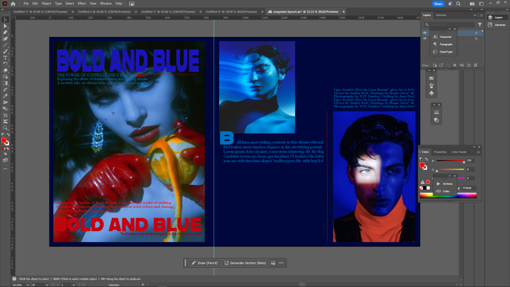
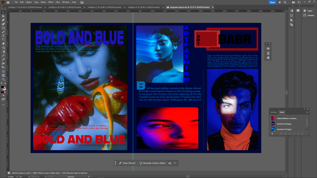
“Bold and Blue,” the editorial’s theme, blends passion and intensity, two qualities essential to the classical romance genre. I imagined a masthead that would both evoke the traditions of classical design and radiate modernity in order to represent this. Inspired by short, recognisable publishing names, the term “BABR” embodies the power and universality of art and love, two essential components of classical romantic literature.
I looked at great 18th and 19th century book covers and engravings for ideas. These frequently included elaborate borders, bold serif or decorative typefaces, and symmetrical layouts. I discreetly integrated these concepts into the masthead by combining bold, clean text with a structural rectangular frame, which represents the elaborate symmetry of ancient art, for a modern twist.
To connect the old with the modern, the masthead’s typography was thoughtfully selected. Its geometric structure alludes to the symmetry present in ancient building designs, even though I chose a sans-serif typeface for “BABR” to communicate modernity and aggressiveness. The bold typeface employed in the title “Bold and Blue” evokes the dramatic typography found on old romance book covers and posters, adding a touch of nostalgia.
I added a hint of drama to the layout to highlight the relationship to classical romance. The contrast between the chilly, deep blue background and the vivid red text evokes the dramatic emotions of sorrow, desire, and passion that are frequently explored in love literature. Blue and red are traditional symbolic colours, with blue signifying depth and reflection and red denoting passion and intensity.
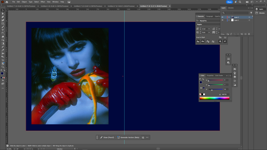
The masthead’s early prototypes had a strong modernist design influence but were unrelated to the traditional romantic motif. This discrepancy was brought to light by classmates’ feedback, which had me go back and review the composition. I was able to better blend current aggressiveness and classical elegance by adding the rectangular frame and changing the text to look more like vintage designs.
In conclusion
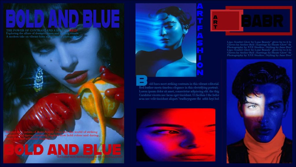
The finished masthead design is a visual representation of the combination of modern aesthetics with classical romanticism. It is daring and pertinent for a contemporary readership while capturing the drama, grace, and timeless quality of the traditional romance genre. The header firmly establishes the editorial’s character as both inventive and nostalgic by carefully fusing typographic elements, colour symbolism, and organised layouts.
refrence
Hollis, R. (2006) Graphic design: a concise history. London: Thames & Hudson.
Lupton, E. (2014) Thinking with type: a critical guide for designers, writers, editors, & students. 2nd edn. New York: Princeton Architectural Press.