One of the most effective tools in graphic design is typography, which conveys not only information but also feelings and provides the project with a positive tone. Typography, in my opinion, is essential to conveying the grace and timeless quality of traditional romantic poetry. This post describes the typographic selections and branding guidelines I have established to give my audience a unified and aesthetically pleasing experience.
For color, I chose a soft, pastel color palette to match the romantic theme.
which symbolizes love and passion, while the body text is a neutral grey, offering high legibility. Accents of gold are used sparingly in the masthead or section dividers to introduce a touch of elegance and luxury.
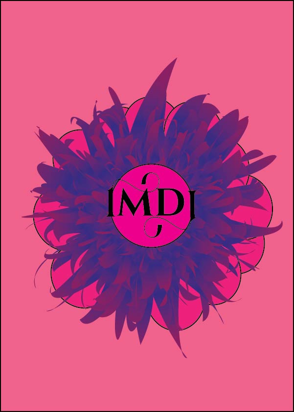
I created a flower using Adobe Illustrator’s star tool for the background. I multiplied the stars with the arrow key, duplicated the star, and made one smaller than the other. I then used the blending option to make it blend, added an effect, and turned it into a flower.
Selecting the appropriate fonts is only one aspect of typography; another is designing a visually appealing arrangement. To ensure legibility, I used a simple, classic serif font for the body of the text. I also used comfortable line spacing to encourage visitors to stay on the page for a while. I chose a gentle, vintage-inspired colour scheme to evoke a romantic mood.
Here are some early mockups showcasing the typography in use:
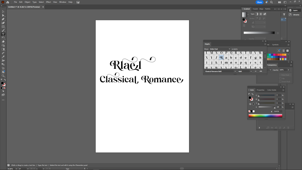
Mock 1: A sample layout with a title in a classical romance font
Mock 2
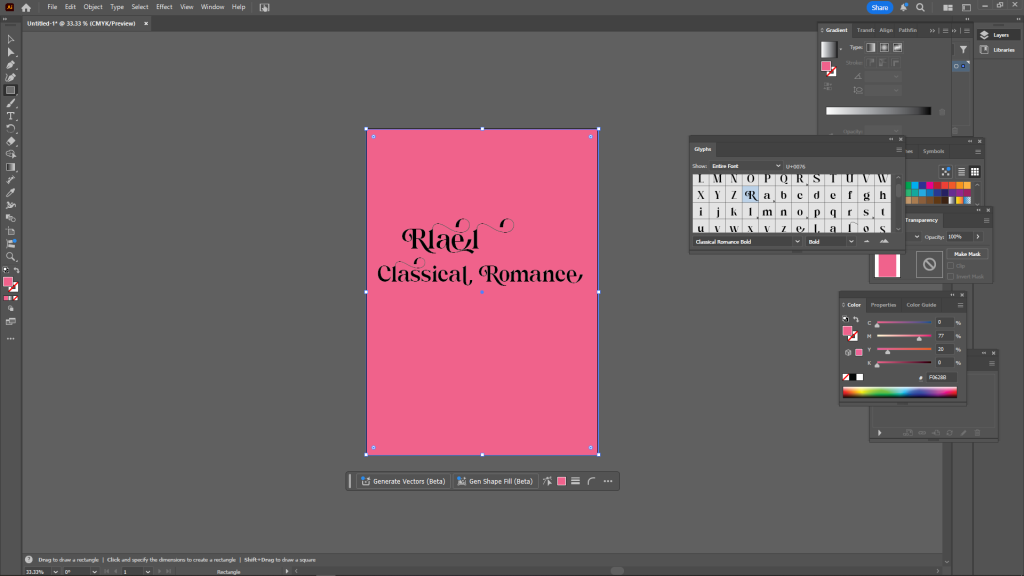
The Blush pink background and clean typography to ensure readability while reinforcing the romantic aesthetic.
One comment I got from my classmates after showing them this design was to change the line spacing in the body of the text. In order to improve readability, particularly for longer text sections, I slightly increased the leading because some readers felt the text was a bit too compact. This improvement made sure the design was both aesthetically pleasing and useful.
This project’s typographic selections aim to transport readers to the ageless, enchanting realm of classic romance novels. I have developed a branding system that conveys warmth and refinement, ideal for a classical romance audience, by fusing sophisticated serif fonts with softer script elements and a colour scheme inspired by the past.
REFERENCE
- GÜNAY, M. (2024). THE IMPACT OF TYPOGRAPHY IN GRAPHIC DESIGN. International Journal Of Eurasia Social Sciences. [online] doi:https://doi.org/10.35826/ijoess.4519.
-