In this blog, we will be exploring the enchanting world of classical romance novels. the purpose of this blog is to delve into the timeless theme and characters that have captivated readers for generations. This blog post is for young university book lovers, literature students, and anyone who appreciates the beauty and depth of classic romantic literature
Romance novels have long captivated readers with their beautiful and elegant writings. this blog post aims to spread the charm ands sophistication of classic romance novels making them appealing to young adults. By delving into these timeless stories, I hope to inspire the new generation to appreciate and enjoy the rich literary heritage of romance literature.
Typography is a key component in editorial design especially for books particularly for romance novels where the inside and the cover design can have a big impact on how the reader feels lets look at two examples to illustrate this.
An elegant illustration of Jane Austen’s Pride and Prejudice
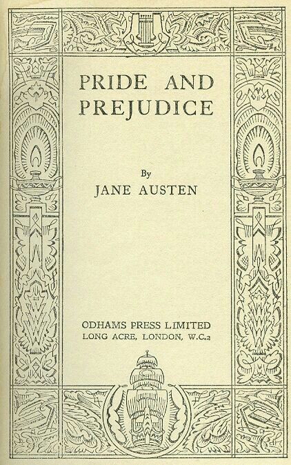
Figure 1. an example of typography why its here
Title: Pride and Prejudice
Author: Jane Austen
Publisher: Penguin Classics
An excellent example of well-designed typography may be found on the cover of Jane Austen’s Pride and Prejudice, which was published by Prejudice Classics. The cover created by Coralie Blickford-smith, is a part of Penguin Clothbound Classics.
The novel’s historical and romantic elements are well complemented by the elegant and timeless classic serif font used for the title of the book. The title is shown clearly and in a greater font size to ensure that the reader’s attention is drawn to it first. The author’s name appears smaller beneath it, forming a distinct hierarchy that organically directs the reader’s attention.
The alignment and spacing are precisely designed, giving the cover a balanced and orderly look. Potential readers will find it inviting because of the regular usage of font sizes and styles, which also adds to the overall readability and aesthetic appeal. Without overpowering the typeface, the elaborate design elements—such as the ornamental borders and motifs—adjust the visual attractiveness.
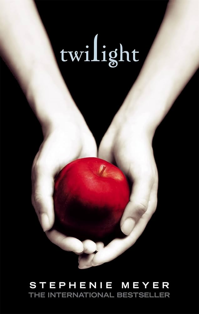
The Bad: Poor Typography in Twlight by stephenie
https://m.media-amazon.com/images/I/61eoeu1UpRL.AC_UF894,1000_QL80.jpg
Title: Twilight
Author: Stephenie Meyer
Publisher: Little, Brown and Company
Let’s delve into an example of poor typographic design: the original cover of Stephenie Meyer’s “Twilight.” The title on this cover used the Papyrus typeface, a choice that faced significant criticism.
Papyrus is often viewed as an amateurish and overused font. Its ornamental and irregular brushstrokes make it unsuitable for a romance novel, especially one with dark and emotional themes. The casual look of Papyrus clashed with the book’s somber tone.
Typography plays a crucial role in setting a book’s tone. Papyrus’s informal, rustic style did not align with the brooding, mysterious atmosphere of “Twilight,” resulting in a disjointed impression.
Moreover, Papyrus is not the most legible typeface, particularly at smaller sizes. Its decorative elements can obscure the title on a book cover, making it harder for readers to quickly identify the book.
In the original design, all text elements—title, author, and body text—were the same weight and size, making it difficult to distinguish between them. The inconsistent use of fonts added to the distraction and unprofessional appearance.
A book cover should look polished and professional. Papyrus, often used in DIY projects, inadvertently suggested a lack of sophistication. This could lead potential readers to perceive the book as poorly written.
The title, author, and body text were presented in a single block without any hierarchy, making it hard to differentiate between them. The lines were too close together, creating a crowded look. The absence of indentations and paragraph breaks made the text appear cluttered and difficult to read. Inconsistent font styles further contributed to a disorganized, amateurish appearance.
In summary, the use of Papyrus on the original “Twilight” cover was a typographic misstep, undermining the book’s dark and romantic themes. A more suitable tyeface could have better conveyed the book’s tone and enhanced its visual appeal.
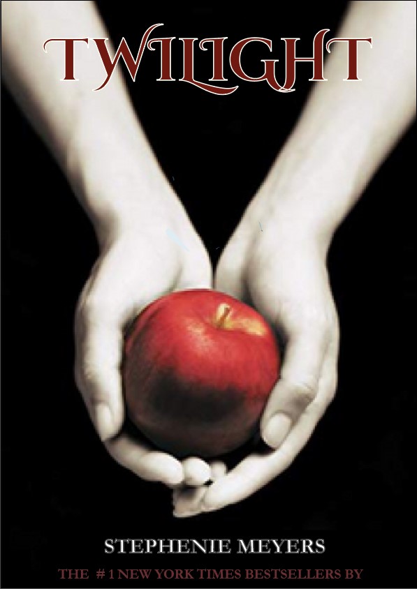
Redesign of the poor example of Typography
REFERENCES
figure one
- Penguin Random House Retail. (2017). Pride and Prejudice | Penguin Random House Retail. [online] Available at: https://www.penguinrandomhouseretail.com/book/?isbn=9780141040349. [Accessed 2 Oct. 2024].
figure two
- ScreenRant. (2020). Twilight: What Every Book Cover Really Means (Including Midnight Sun). [online] Available at: https://screenrant.com/twilight-midnight-sun-books-covers-meanings-explained/. [Accessed 3 Oct 2024].