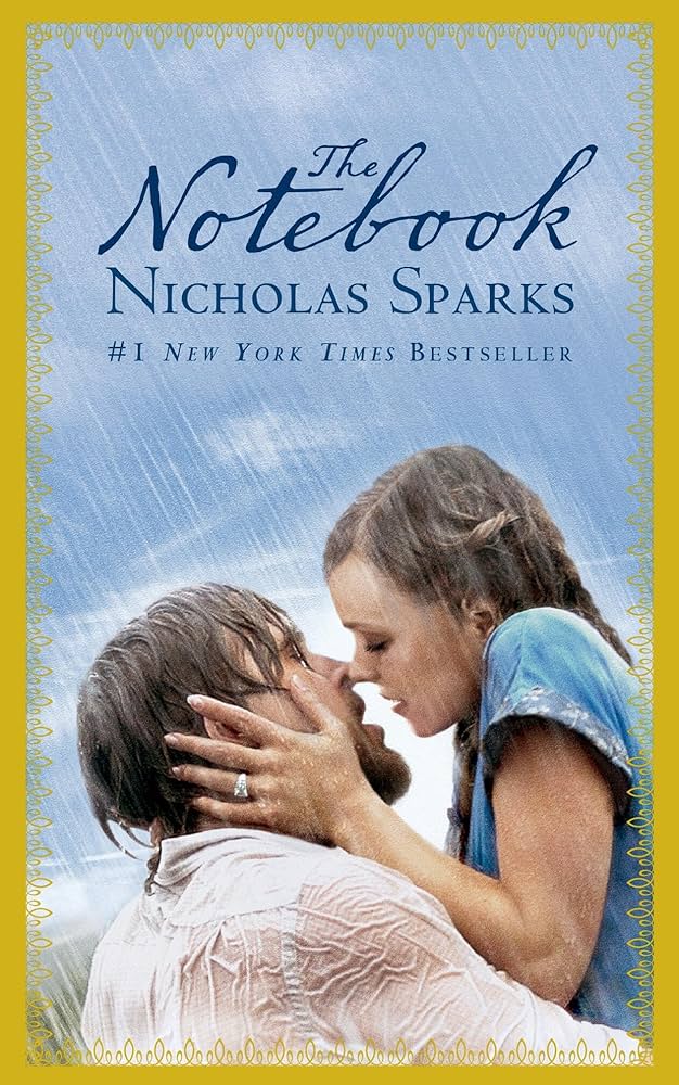
A good example to use of effective use of composition and 2d layout traditional editorial design can be found in the cover of the romance novel the notebook by Nicholas sparks, the cover of this novel is very much well know and appreciated for its design.
Title: The notebook
Author: Nicholas sparks
Publisher: Grand Central Publishing
Sparks, N. (1996). The Notebook. Warner books.
https://m.media-amazon.com/images/I/81qh61Wsb6L.AC_UF894,1000_QL80.jpg
The cover design of Nicholas Sparks’ ‘The Notebook’ skilfully employs composition and 2D layout to convey the core of the narrative, according to my analysis of the book. The cover’s images, typography, and colour scheme all work in unison to inspire a sense of romanticism and nostalgia, drawing from ideas covered in Alex W. White’s “The Elements of Graphic Design” and reinforced by observations from articles on Publishers Weekly and The Guardian.”
The layout directs the viewers eye from the tittle image and then the authors name creating a cohesive and engaging visual flow. This careful arrangement and use of space showcase effective editorial design, making the message clear and impactful
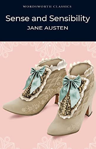
colour that differ from the title. The focal point are not clear and the design al l together does not covey the themes of romance or unexpected parents effectively.
POOR EXAMPLE

https://pictures.abebooks.com/isbn/9781853260162-uk.jpg
The Wordsworth Classics edition (Wordsworth Editions, 1992) of sense and sensibility by jane Austen is a classic example of a badly designed cover.
The fairly unimpressive depiction of a woman on this cover does not adequately convey the richness and nuance of Austen’s story. With the image in the centre and the title and author’s name in standard fonts, the composition is rather simple. The typography lacks originality, and the overall layout seems uninspired and lifeless.
This cover’s use of composition to grab the reader’s attention and generate interest is ineffective in terms of 2D layout and conventional editorial design. There is no visual hierarchy to direct the viewer’s attention, and the image lacks depth and context. No design components that could improve the layout’s aesthetic appeal or convey the environment and characters of the book are used.
The style and layout of a well-designed cover should ideally convey the depth of the story. For “Sense and Sensibility,” this can entail adding details that allude to the Regency period, the Dashwood sisters’ divergent personalities, or the narrative’s poignant tone. A cover might, for example, feature a more dynamic composition, exquisite Regency-style lettering, and imagery that alludes to the novel’s themes of love, heartbreak, and social expectations.
We can see how important it is to use composition and 2D layout well in conventional editorial design by contrasting this Wordsworth Classics edition with covers that have been more carefully planned. In addition to drawing readers in, a well-designed cover improves their comprehension and enjoyment of the narrative before they have even turned the first page.
REFRENCE
- White, A.W. (2011) (PDF) The Elements of Graphic Design, second edition, the element of graphic design . Available at: https://www.researchgate.net/publication/262934023_The_Elements_of_Graphic_Design_Second_Edition (Accessed: 25 October 2024).
- Figure 1. The notebook : Sparks, Nicholas: Amazon.co.uk: Books (no date) The Notebook : Sparks, Nicholas: Amazon.co.uk: Books. Available at: https://www.amazon.co.uk/Notebook-Nicholas-Sparks/dp/1455582875 (Accessed: 25 October 2024).
- Figure 2. Austen, J. (1992) Sense and sensibility (wordsworth classics), AbeBooks. Available at: https://www.abebooks.co.uk/9781853260162/Sense-Sensibility-Wordsworth-Classics-Austen-1853260169/plp (Accessed: 25 October 2024).