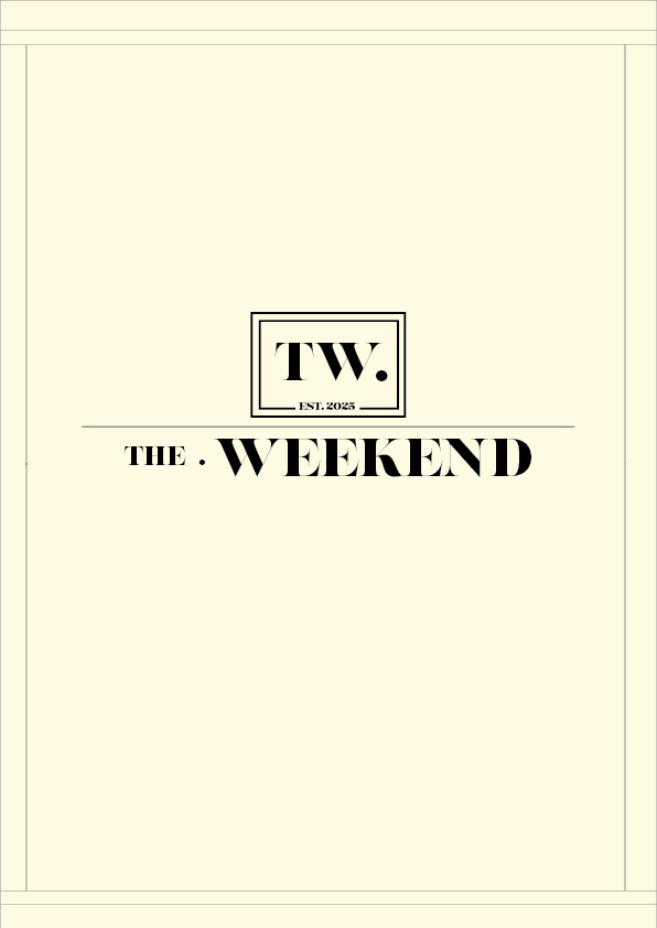
The masthead for my editorial project is The Weekend, designed as a conceptual logo that communicates both luxury and nostalgic calm. I aimed to create a masthead that could sit confidently on a cover like a real magazine title. I needed it to behave like a real magazine identity: instantly recognisable, readable on different backgrounds, and consistent across multiple covers and spreads while also representing the theme of quiet, curated moments and weekends as a space for rest, reflection, and elegant living.
To meet the conceptual requirement, I developed the masthead by combining two ideas: high-end editorial branding (fashion magazine influence, confident typography, clean layout) and A vintage stamp/label identity (nostalgic, timeless, “collected” feeling—like a classic catalogue or archive)
This is why I designed the logo using a refined typographic structure and placed it within a framed mark (“TW.”) like a stamp. The “TW” functions like a signature seal, suggesting authenticity, heritage, and a consistent brand mark that can be repeated across covers and pages.
My early ideas focused on finding a typographic voice that felt vintage but not overly decorative. When the wordmark looked too plain, I introduced editorial devices like framing, thin rules and a secondary mark. When it looked too busy, I simplified again and focused on spacing, alignment and hierarchy. This iterative process helped me move from “just text” to a designed identity with a consistent structure.
Additionally, I changed the text to fully connect with the weekend title rather than using random words. Vintage luxury is at its best when it comes to minimalism, so narrowing it down without adding excessive clutter or using too many characters in the logo was the best choice, and it ultimately connected really well with the editorial spread page.
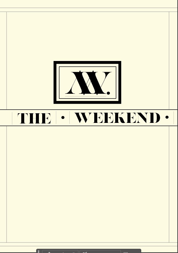
I used Amandine for the masthead because it carries an elegant editorial character and feels suitable for luxury publications. I refined the letter spacing (tracking) so the wordmark feels confident and breathable rather than cramped. I also avoided obvious distortion: instead of stretching the masthead aggressively, I refined proportions through subtle scaling, spacing, and (when needed) outline/stroke adjustments to keep the letterforms strong.
The monogram gives me flexibility for modest places (like a corner badge or social symbol) and aids in brand memory. Additionally, the frame and rule lines create consistency throughout the whole issue by directly connecting to the border/rule text in my spreads.
The covers are more photography-led; I tested the masthead on light and dark backgrounds. I kept the colour use very minimal and focused on high contrast so the masthead remains readable and premium. Where imagery was busy, I placed the masthead in calmer areas or created breathing space so it didn’t compete with the image.
Audience alignment
The Weekend caters to readers who appreciate serene, well-curated aesthetics and those who appreciate editorial culture, film-like photography, and introspective writing. I also targeted audiences between the ages of 24 and 45 because they typically appreciate the feeling of vintage, elegant luxury that makes them feel nostalgic. My masthead selections were informed by this: a classic type-led identity, sparse embellishment, and a disciplined arrangement that exudes confidence rather than loudness.
Once finalised, the masthead anchored my cover grid: consistent top placement, consistent clear space, and consistent hierarchy for cover lines. This meant my three covers could vary in mood while still reading as consecutive issues of the same magazine.
References
1. Lupton, E. (2014). Thinking with Type. 2nd edn. New York: Princeton Architectural Press.
Müller-Brockmann, J. (2007). Grid Systems in Graphic Design. Zurich: Niggli.