For my editorial information pages, I designed a set of double-page spreads for The Weekend that translate the brand identity into a readable magazine system. The articles I used are nature and conservation pieces, so I aimed for a calm, premium tone where photography sets the atmosphere, and typography supports comprehension. I selected these texts because they fit The Weekend’s reflective mood while still offering clear informational content to structure within a grid.
Grid structure and composition
I built a repeatable master grid to control margins, gutters and column widths across all spreads. This grid gave me consistency while still allowing variation: some spreads are image-dominant with a full-bleed hero photograph, while others use modular blocks for multiple images, captions and pull quotes. Keeping alignment consistent (edges lining up, repeated spacing, consistent panel padding) reduced visual noise and helped the spreads feel cohesive and professional.
Spread 1 opener Caption: Opening spread using image-led atmosphere and clear headline hierarchy.
Typography and hierarchy
My hierarchy is consistent across spreads: headline first, then standfirst or pull quote, then body copy, then captions and credits. I used Amandine for headlines to bring vintage editorial personality and set tone quickly. Gotham Black supports body copy because it is structured and legible in columns, especially next to busy imagery. Playfair Display is used for captions so supporting information feels classic and distinct from the main text. During refinement I adjusted leading, line breaks and spacing so paragraphs felt readable and consistent from spread to spread.
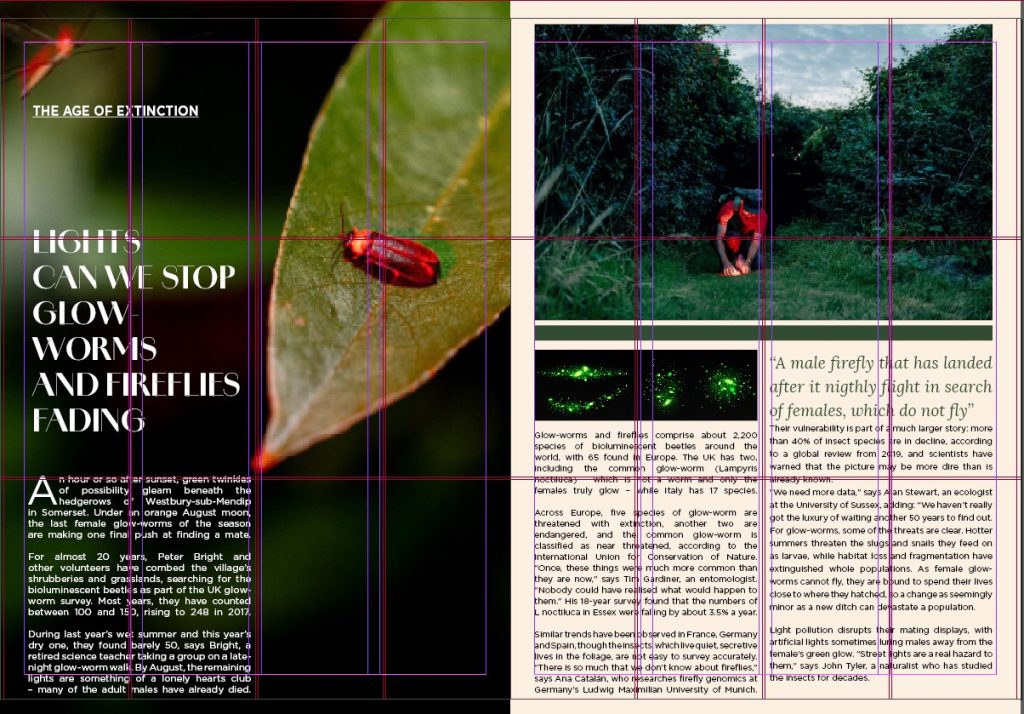
Spread 2
Colour palette and tone
I kept colour restrained and warm using my CMYK palette: 16/2/100/0, 0/11/25/4, 0/37/38/65, 0/31/21/0, and 0/58/53/4. Deep brown anchors borders and rules, warm cream creates a calm reading space, and soft pink/coral tones support caption panels and quotes. The accent yellow is used sparingly for highlights, so the pages still feel luxurious rather than loud.
Spread 3
Spread 4
Spread 5
Spread 6
Spread 7
How article content shaped layout decisions
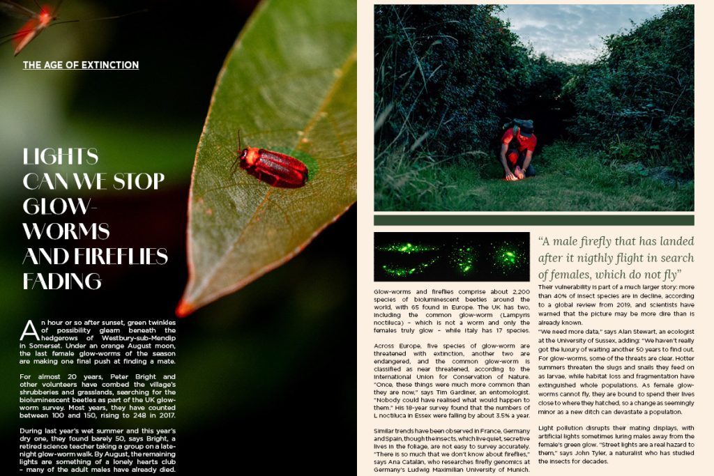
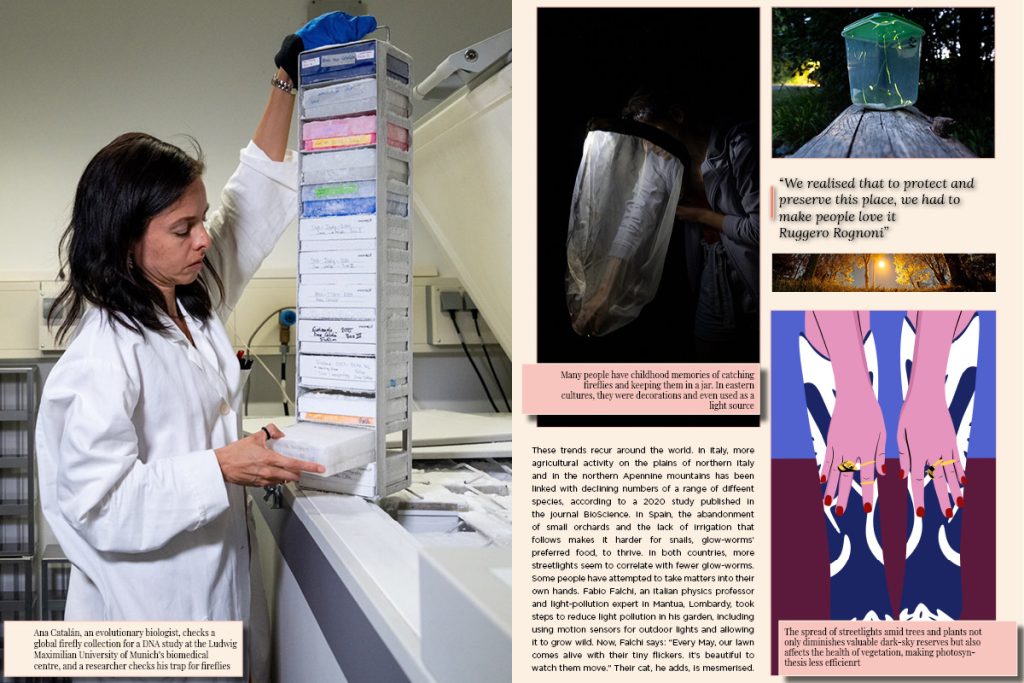
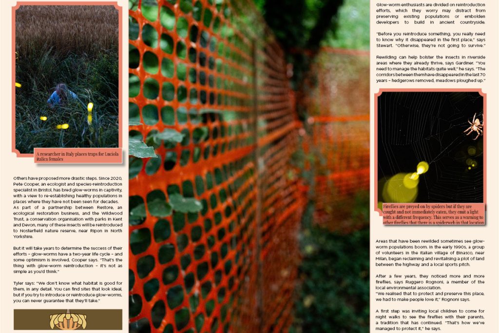
Because the Country Diary piece is observational, I used spacious pacing and a strong opening image to establish mood before introducing text blocks. The owl article contains a more energetic hook, so I used a bolder focal image paired with structured information blocks to keep the spread readable. The glow-worm/firefly article carries urgency, so I strengthened hierarchy and contrast to pull attention to key statements while keeping the overall system consistent with the brand.
Progression from draft to refined
Early drafts had too many competing elements (too many boxes and inconsistent caption placement). I refined by simplifying: fewer panel styles, standardised captions, tighter alignment to the grid, and more breathing room. This improved reading flow and strengthened brand consistency across all spreads.
During layout refinement, I also checked the spreads at different zoom levels to simulate how tutors will view them on WordPress. This helped me spot areas where body text felt too heavy or where caption boxes needed more padding. I made small adjustments to tracking, leading, and column width so paragraphs read smoothly and the page rhythm stays consistent. These micro-edits improved professionalism by making each spread feel more controlled and intentionally typeset.
REFERENCE
Beer, A.-J. (2025) ‘Country diary: An unexpected vista of sky-light and symmetry’, The Guardian, 30 September. Available at: https://www.theguardian.com/environment/2025/sep/30/country-diary-an-unexpected-vista-of-sky-light-and-symmetry (Accessed: 04 January 2026).
Frost, N. (2025) ‘Conservation: endangered insects… glow-worms and fireflies… dwindling populations’, The Guardian, 7 November. Available at: https://www.theguardian.com/environment/2025/nov/07/conservation-endangered-insects-glow-worms-firefies-europe-dwindling-populations (Accessed: 04 January 2026).
Greenfield, P. (2025) ‘What a hoot! Owl sightings increase in London – and not just in the leafy suburbs’, The Guardian, 9 June. Available at: https://www.theguardian.com/environment/2025/jun/09/owl-sightings-increase-london-not-just-leafy-suburbs-aoe (Accessed: 04 January 2026).
Unsplash contributors (n.d.) Photographs used in layouts. Available at: [add URLs when located] (Accessed: 04 January 2026).