I created a responsive design that works flawlessly on mobile devices to make sure the Rock in Rio app is always accessible. In the event that consumers lose their confirmation email, they may easily access their digital tickets within the app, guaranteeing a seamless festival entrance. I positioned the main navigation choices, like lineup, tickets, and interactive maps, at the top of the UI to improve the user experience. Especially on smaller screens, this thoughtful positioning increases visibility and facilitates users’ ability to find key functions quickly. Additionally, it adheres to contemporary app design principles, which place important components in conspicuous locations to minimize effort and enhance usability for novice users.
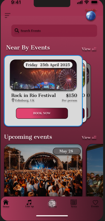
To improve overall usability, I placed the primary navigation menu at the bottom of the screen, aligning with modern mobile UI standards. This placement ensures that users can quickly access essential features like the lineup, interactive map, and ticket booking with just one hand, which is ideal for festival-goers navigating crowded environments. The consistent placement of these icons across all screens strengthens the app’s visual flow and makes it intuitive for first-time users.
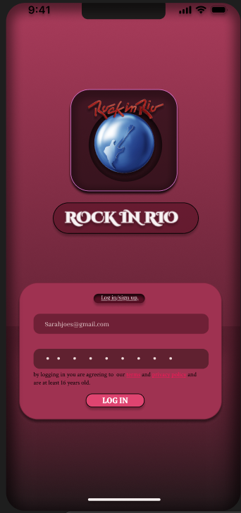
The login page received minimal but impactful adjustments. The login button and text fields were resized and spaced to enhance touch accessibility, ensuring users can easily sign in on smaller screens. This preserves the clean and straightforward login process while maintaining brand consistency with the dark pink and black color theme.
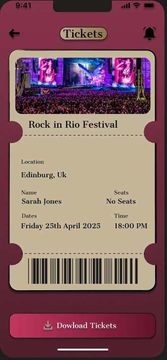
The tickets page was redesigned to focus on clarity and ease of navigation. Ticket details are presented in a single, scrollable vertical layout, with the QR code and download option clearly visible. This design approach ensures users can view all ticket details without the need for unnecessary screen adjustments, which is crucial for fast access during entry checkpoints.
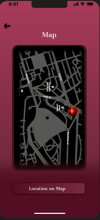
The map page highlights an interactive layout that allows users to find their way around the City with ease. The interactive map was designed to make on-site navigation intuitive and stress-free for festival-goers. By using a dark map with high-contrast markers, the design remains visually appealing while maintaining practical readability, even under bright outdoor conditions, ensuring users can easily locate stages, food stalls, restrooms, and entry points even in bright sunlight. By incorporating pinch-to-zoom and clickable icons for stage details, the feature mirrors the usability found in popular event apps like Tomorrowland’s. This functionality directly supports festival safety and convenience, enabling users to move confidently across the venue.
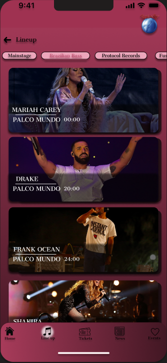
The lineup and event pages were structured to feature high-quality artist images, categorized events, and countdown details. To keep attendees informed, the Rock in Rio app integrates real-time notifications for lineup changes, artist announcements, and exclusive offers. These alerts are visually integrated into the home dashboard and push notifications, ensuring that important updates, such as sudden weather changes or gate information, are never missed. Users can also customize which notifications they receive, allowing them to focus on updates for their favorite artists or events. This feature enhances the overall user experience by providing timely information in a fast-moving festival environment. Inspired by the dynamic alert systems used in the Coachella app, it ensures that users remain connected and informed throughout the event. This design not only mirrors the vibrancy of Rock in Rio but also draws inspiration from successful music apps like Tomorrowland and Coachella, where visual storytelling is key to user engagement.