The cover of a book or magazine plays a pivotal role in attracting readers. In this post, I’ll document the process behind designing three potential covers for my classical romance-themed publication.
Design Thinking
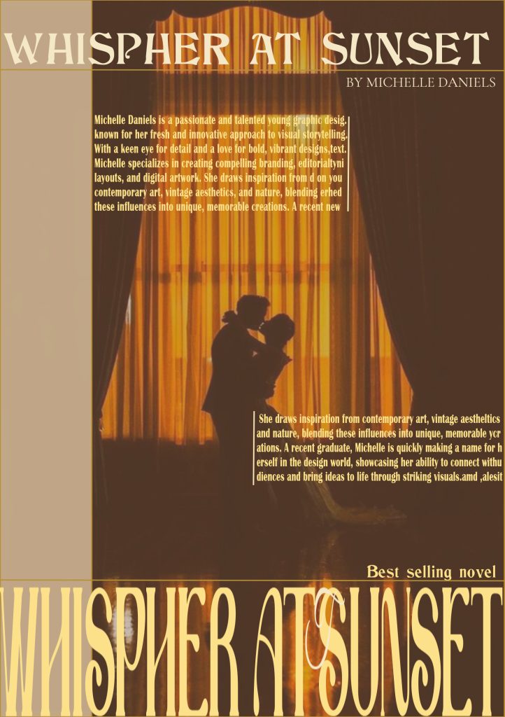
For the first cover design,It is designed in a classic romance style. It features a silhouette of a couple in an intimate embrace, set against a backdrop that suggests a sunset or a warm, golden light. The couple appears to be standing in front of a window or a curtain, which is illuminated from within, casting a soft glow on their forms. The title of the book is prominently displayed at the top in a serif font, with the author’s name just below it. The overall color scheme is warm, with a gradient of orange and yellow tones that evoke the feeling of a romantic sunset. The text on the cover is minimalistic, with the title being the most prominent element, and it is designed to draw the viewer’s attention to the romantic scene depicted.
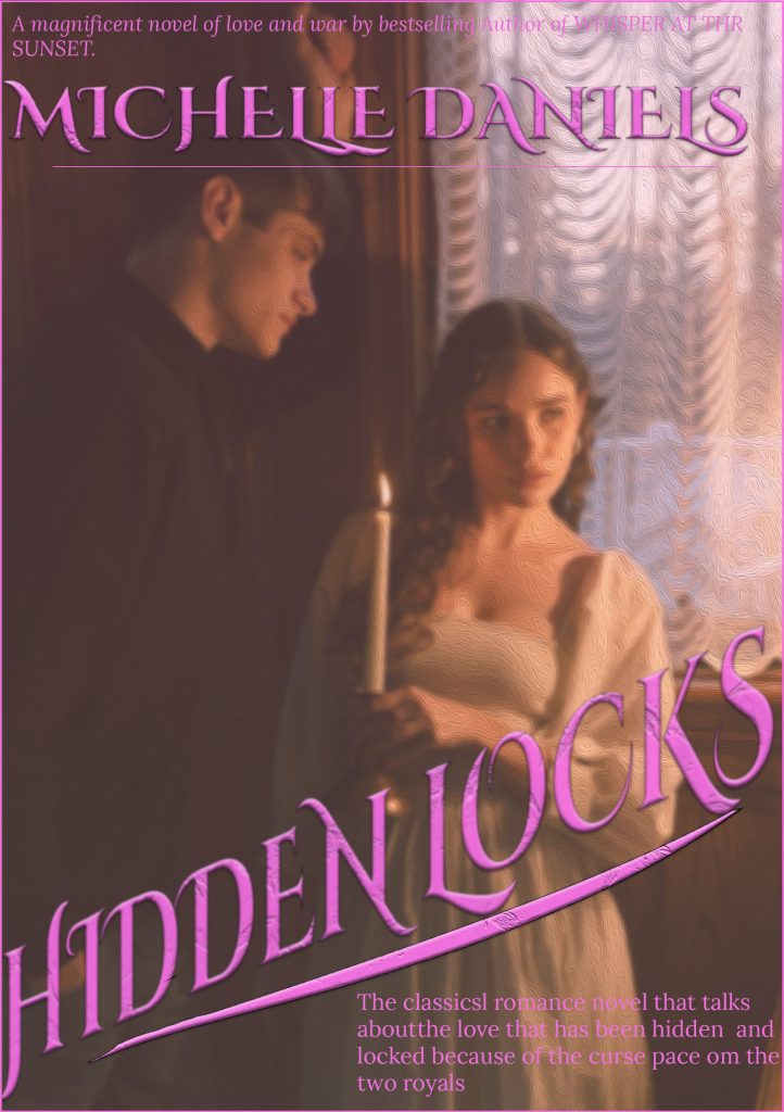
For the second cover, I used a more minimal approach with a single features a romantic and somewhat mysterious atmosphere.
The cover uses a warm, muted color palette with a dominant pinkish-purple hue that gives it a soft and romantic feel. The background is a gradient of this color, which fades from a darker shade at the top to a lighter one at the bottom.
The title “Hidden Locks” is written in a cursive, serif font with a slight italicization. The font is elegant and ornate, suggesting a historical or classical theme. The color of the title is a darker shade of background, which makes it stand out and be easily readable.
The central image on the cover is a silhouette of a woman’s profile. holding a candle, which adds to the mysterious and romantic ambiance. The candlelight suggests a warm and intimate setting.
There is a tagline or description text at the bottom of the cover in a smaller, sans-serif font. It reads, “The classical romance novel that talks about the love that has been hidden and two royals.” This text provides a hint about the book’s content and genre.
The design is simple yet evocative, with a focus on the silhouette and the title. The use of a silhouette and candlelight creates a sense of mystery and allure, which is often associated with romantic and historical fiction. choice of colors and fonts suggests its a story that is be set in a past era, with a focus on the emotional journey of the characters.
The cover design effectively communicates the book’s romantic and historical themes, using color, typography, and imagery to create an inviting and intriguing visual for potential readers
Composition and Color
Each cover uses a different approach to composition. The first cover has the illustration placed centrally, with the title at the top and the author’s name at the bottom. The second cover is simpler, with the love letter placed off-center, allowing the text to take center stage.
The color palette varies from soft pinks and purples in the first cover to golds and creams in the second, and muted reds and pinks in the third. These colors reflect different moods—passionate, luxurious, and gentle—all within the theme of romance.
Feedback suggested that the first cover felt a bit too busy, so I simplified the design by removing some of the elements around the illustration. For the second cover, feedback recommended making the text slightly bolder to ensure legibility, especially in smaller sizes.
Conclusion
Each cover reflects a different interpretation of the classical romance theme. Whether through vintage illustrations, minimalism, or symbolic imagery, the covers aim to evoke emotion and attract readers who appreciate the depth and beauty of classical romance literature.